Introduction
“Above the fold” is one of those terms that shows up everywhere in digital work. You hear it in design reviews, marketing briefs, landing page feedback, and ad discussions. It’s treated as common knowledge, yet it’s rarely explained in a consistent way.
The phrase gets used to justify decisions about layout, messaging, and priority. Sometimes it’s treated as a hard rule. Other times it’s dismissed as outdated. That gap between how often the term is used and how loosely it’s understood is why it keeps resurfacing.
In this guide, you’ll learn what “above the fold” actually means in modern contexts, how the idea evolved, and how it’s applied today across websites, landing pages, and advertising. The goal is simple. By the end, you’ll know how to use the concept clearly and realistically, without overthinking it or misusing it.
Key Takeaways
- “Above the fold” refers to what a visitor can see before they scroll.
- The “fold” is not a fixed height online. It changes by device, screen, and layout.
- Above-the-fold space should communicate the page’s purpose fast.
- Strong above-the-fold content earns the next action, often a scroll, not an instant click.
- The term helps when it guides priority. It hurts when it becomes a hard rule.
Disclaimer: I am an independent Affiliate. The opinions expressed here are my own and are not official statements. If you follow a link and make a purchase, I may earn a commission.

What Is Above the Fold
“Above the fold” is the portion of a page that a visitor can see immediately, without scrolling or taking any other action.
On a website, this means the content visible within the browser window when the page first loads. On a phone, it is what appears on the screen before a swipe. The exact boundary changes from user to user, but the idea stays the same. It marks the line between what is seen instantly and what requires effort to reveal.
Importantly, “above the fold” is not a fixed height and not a specific number of pixels. Different devices, screen sizes, orientations, and browser settings all affect where that line falls. Because of this, the fold should be understood as a zone, not a precise measurement.
The term also does not describe what must go in that space. It simply names it. Decisions about headlines, navigation, images, or calls to action come later and depend on context and goals. At its core, “above the fold” only answers one practical question:
What does the visitor see first?
Once that is clear, teams can decide how to use that space responsibly.

Where the Term Comes From
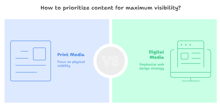
The phrase “above the fold” comes from print newspapers.
Newspapers were traditionally folded in half when displayed on newsstands. Only the top half of the front page was visible to someone walking by. Editors placed their most important headlines and stories in that space because it was the only part guaranteed to be seen.
In that environment, the fold was a physical boundary. Content above it determined whether a reader would stop, pick up the paper, and continue reading. Content below it required a deliberate action.
When the term carried over into digital work, the physical fold disappeared, but the underlying idea remained. Every page still loads with a visible area before any interaction. That first view still shapes how people interpret what they’re seeing.
This origin matters because it explains why the term persists. “Above the fold” was never about restricting content or enforcing layout rules. It was about prioritizing what appears first when attention is limited.
The medium changed. The behavior did not.
Why Above the Fold Matters
Above-the-fold content matters because it shapes how a page is understood in its first moments.
When a page loads, visitors make quick judgments. They decide whether they are in the right place, whether the content feels relevant, and whether it’s worth continuing. Those decisions happen before scrolling, based only on what is visible at first.
This does not mean everything important must be crammed into the first screen. It means the first screen must orient the visitor. It should communicate what the page is about, who it is for, and what kind of value follows.
Above-the-fold space also sets expectations. Clear messaging reduces uncertainty. Confusing or vague messaging increases friction. When people feel unsure, they leave. When they feel oriented, they scroll.
From a marketing and performance perspective, this is where above the fold earns its reputation. Not because it forces action, but because it determines whether any further action happens at all.
In practice, above-the-fold content matters most for:
- New visitors who are unfamiliar with the brand or page
- Paid traffic where intent is broad
- Landing pages with a single goal
- Situations where attention is limited
Used correctly, above-the-fold content supports the rest of the page. Used poorly, it makes even strong content harder to reach.

What Belongs Above the Fold (and What Doesn’t)
Above-the-fold space is not about packing in as much content as possible. It’s about priority and clarity.
What belongs above the fold is whatever helps the visitor understand three things quickly:
- What this page is about
- Who it is for
- What to do next, even if that next step is simply to scroll
In most cases, that means a clear headline, a short supporting explanation, and visual structure that makes the page easy to read. Navigation often belongs here as well, because it helps users orient themselves immediately.
What does not belong above the fold is anything that competes with that clarity. Long paragraphs, secondary details, dense explanations, or multiple competing calls to action tend to overwhelm the first screen. They slow understanding instead of improving it.
It’s also a mistake to treat above-the-fold space as the only place that matters. Important content can live below the fold, as long as the first screen gives visitors a reason to keep going. Scrolling is not a failure. Confusion is.
A useful rule of thumb is this: Above the fold should answer the visitor’s initial questions. The rest of the page should deliver on those answers.
When teams use above-the-fold space this way, the page feels focused instead of crowded, and the content below becomes easier to engage with.
How Above the Fold Is Used on Modern Websites
On modern websites, “above the fold” refers to the first screen a visitor sees when a page loads, across devices and screen sizes.
Because layouts are responsive, there is no single fold. A desktop monitor, a laptop, a tablet, and a phone all show different amounts of content at first glance. As a result, teams treat above the fold as a flexible zone, not a fixed line.
In practice, modern websites use above-the-fold space to do four things well:
First, they set context. The visitor should immediately understand what the site or page is about. This usually comes from a clear headline and supporting visual structure.
Second, they establish relevance. The content should signal who the page is for and why it matters to that visitor. This helps reduce bounce from people who are unsure they’ve landed in the right place.
Third, they guide attention. Layout, spacing, and hierarchy matter here. The goal is not to overwhelm, but to lead the eye naturally toward the next interaction.
Fourth, they invite continuation. That continuation might be a scroll, a click, or a simple pause to read. Modern design assumes scrolling is normal, but it still has to be earned.
Importantly, good modern websites do not try to “finish the job” above the fold. They use it to open the conversation. When the first screen feels clear and intentional, visitors are far more willing to explore what comes next.

Where Above the Fold Gets Misused
Above the fold becomes a problem when it’s treated as a rule instead of a reference point.
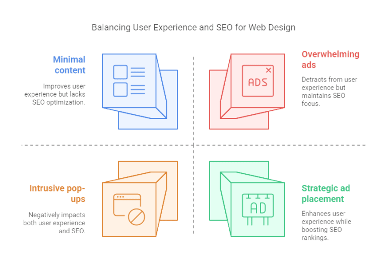
One common misuse is forcing too much content into the first screen. Teams try to include every message, feature, and call to action at once. The result is clutter. Instead of helping visitors understand the page, it slows them down and makes the page harder to read.
Another misuse is assuming everything important must live above the fold. This leads to cutting useful explanations, removing supporting details, or hiding context that actually helps conversion. Strong pages use the first screen to orient, then let the content below do the heavy lifting.
Above the fold is also misused in SEO discussions. It’s sometimes framed as a ranking requirement or a technical checkbox. In reality, search engines do not reward or punish pages simply based on what sits above the fold. What matters is overall usefulness, clarity, and engagement, not pixel placement.
A final misuse is designing for an imaginary “average” screen size. Because there is no single fold, optimizing for a specific height can cause layouts to break on real devices. Treating the fold as flexible avoids this trap.
In short, above the fold works when it guides priorities. It fails when it turns into a constraint. Pages perform better when the first screen sets direction and the rest of the page is allowed to do its job.
Does Above the Fold Actually Affect Results?
Above the fold affects results indirectly, not mechanically.
There is no switch that makes a page perform better simply because something sits above the fold. What changes results is how effectively the first screen helps visitors understand the page and decide to continue.
When above-the-fold content is clear, relevant, and well-structured, people are more likely to:
- Stay on the page
- Scroll further
- Engage with the content
- Take the intended next step
When it’s vague or cluttered, people leave before the page has a chance to work.
This is why above the fold shows up so often in performance discussions. It influences behavioral signals, not algorithms. It shapes bounce rates, scroll depth, and engagement patterns, especially for first-time visitors and paid traffic.
It’s also context-dependent. Above-the-fold content matters more when:
- The visitor has low familiarity with the brand
- The page has a single, focused goal
- Traffic comes from ads or broad search queries
It matters less when:
- Visitors already know what they’re looking for
- The page serves as a reference or resource
- Users arrive with strong intent and patience
So the right conclusion is not that above the fold “doesn’t matter,” nor that it guarantees results. It matters because it determines whether the rest of the page ever gets a chance to perform.
Used correctly, above the fold supports outcomes. Used poorly, it quietly limits them.

Conclusion
“Above the fold” is not a rule, a ranking factor, or a fixed section of a page. It is a simple way to describe what people see first.
That first screen matters because it sets direction. It tells visitors what the page is about, who it’s for, and whether continuing is worth their time. When that message is clear, the content below gets a fair chance to do its work. When it isn’t, even strong pages struggle.
The most useful way to think about above the fold is as a priority check, not a layout constraint. It helps teams decide what must be understood immediately and what can unfold naturally as the visitor scrolls.
Used with restraint, the concept stays practical and relevant. Used rigidly, it becomes noise. The difference is not where content sits, but whether the first view makes sense to the person seeing it.
To learn more check out our Marketing Glossary.

Frequently Asked Questions (FAQs)
What does “above the fold” mean on a website?
It means the content a visitor sees immediately when a page loads, before they scroll.
Is there a fixed height for above the fold?
No. The fold changes based on screen size, device, browser, and layout. It’s a flexible zone, not a fixed measurement.
Does above-the-fold content affect SEO rankings?
Not directly. Search engines don’t rank pages based on pixel placement. Above-the-fold content matters because it affects user behavior, not because it’s a ranking factor by itself.
Should all important content be above the fold?
No. The first screen should orient the visitor and set expectations. Detailed explanations and supporting content often work better below the fold.
Is above the fold still relevant on mobile devices?
Yes, but the concept adapts. On mobile, above the fold refers to the first visible screen before a swipe. Clarity still matters, even though scrolling is common.
Does scrolling mean users are disengaged?
No. Scrolling is normal behavior. The goal of above-the-fold content is to earn the scroll by making the page feel clear and relevant.
Is above the fold mainly a marketing concept?
It’s a visibility concept used across marketing, design, advertising, and publishing. Different fields apply it differently, but the idea stays the same.
What’s the biggest mistake people make with above the fold?
Treating it as a rigid rule. When teams force too much into the first screen or design for a single screen size, clarity suffers.
0 Comments