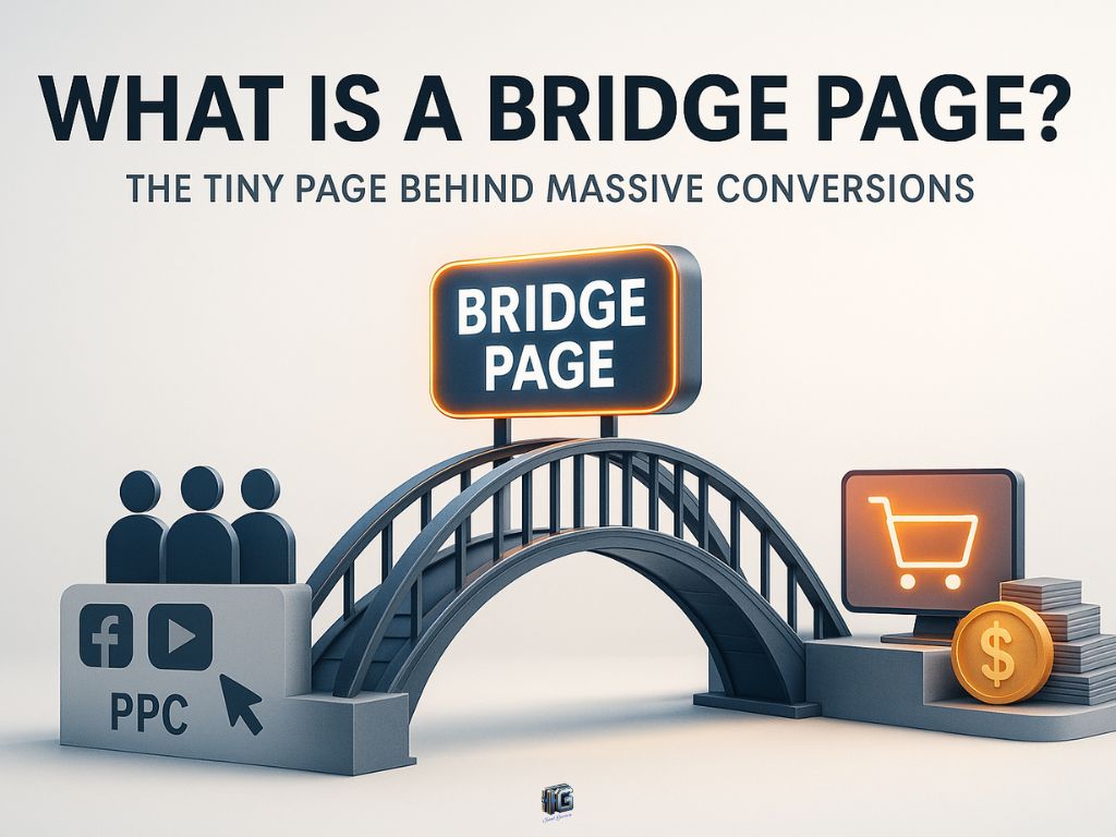
Introduction
Most people send traffic straight to an offer and wonder why conversions stay flat. The reason is simple: visitors arrive cold, with no context and no trust.
A bridge page solves that.
It’s a short page that connects the traffic source with the destination. Instead of dropping people into confusion, it prepares them for what’s next, explaining why the offer matters, why they should care, and what to expect.
In this article, you’ll learn what a bridge page is, why it’s often the missing link in a funnel, the elements that make one effective, common mistakes to avoid, and when it should or shouldn’t be used.
Key Takeaways
- A bridge page connects the traffic source to the destination by adding context and trust.
- Skipping a bridge page often leads to message mismatch and wasted clicks.
- Effective bridge pages focus on clarity, expectation-setting, and a single next step.
- Different bridge page formats address different gaps such as confusion, skepticism, or caution.
- Common mistakes include overselling, vague messaging, and unnecessary distractions.
- A bridge page strengthens funnel performance by smoothing transitions between steps.
- Knowing when to use or skip a bridge page prevents unnecessary friction.
Disclaimer: I am an independent Affiliate. The opinions expressed here are my own and are not official statements. If you follow a link and make a purchase, I may earn a commission.
What Is a Bridge Page?
A bridge page is exactly what it sounds like: a page that acts as a bridge between where visitors come from and where they are going next.
In most funnels, the path is simple: traffic source → destination page. But when you send people directly to a sales page, sign-up form, or product, you risk losing them. Why? Because they arrive without context.
A bridge page changes that.
It’s a short, focused page placed in between the click and the conversion. Its job is not to overwhelm or sell everything upfront. Instead, it introduces, frames, and prepares. It tells the visitor why the next step matters, what they can expect, and why they should keep moving forward.
Think of it as a translator. Your ad, post, or content makes one promise. The destination page makes another. The bridge page connects those promises so the message feels consistent and trustworthy.
Without it, visitors can feel a disconnect: they clicked for one reason, but land on something that looks or feels unrelated. That mismatch creates hesitation, which often prevents visitors from moving forward.
With it, visitors feel guided. They understand why they’re here, what’s about to happen, and why it matters to them. That clarity is often the difference between a bounce and a conversion.
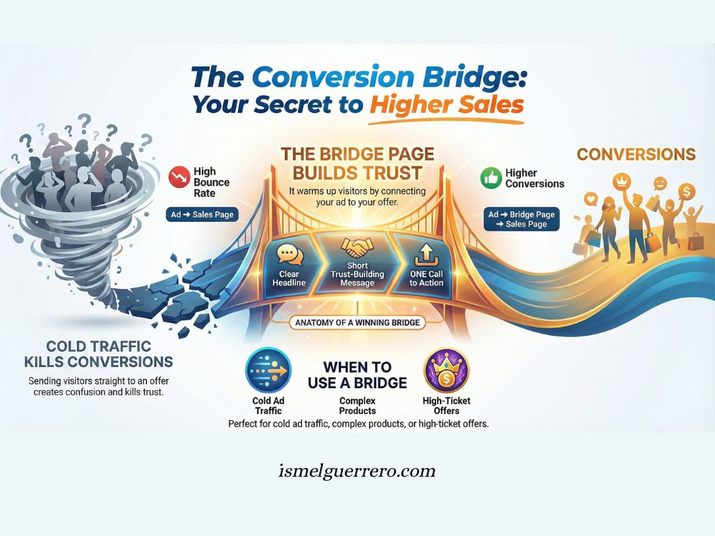
This isn’t just a theory. Industry conversion rate benchmarks consistently point to message mismatch between ads and landing pages as a leading driver of high bounce rates. When the ad and the page don’t align, downstream conversions tend to drop.

Why Bridge Pages Matter (And Why Most Ignore Them)
On the surface, a bridge page looks simple. Just one short step before the main destination. But the impact it has on conversions is often meaningful, especially in cold or high-friction traffic.
Here’s why.
When someone clicks an ad, a post, or a link, they bring a set of expectations with them. They think they’re about to see one thing. If the page they land on doesn’t match those expectations, trust drops instantly. Even a small disconnect can be enough to lose them.
A bridge page prevents that.
It gives the visitor context before they move on. It frames the offer, warms them up, and shows them why the next page matters. Instead of hitting them cold, you guide them through a natural flow:
- Message match: The promise that made them click continues smoothly into the bridge page.
- Clarity: They know exactly what the next step is and why it’s relevant.
- Trust: By explaining and setting expectations, you reduce hesitation.
And when context and trust go up, conversions follow.
The mistake most people make is skipping this step entirely. They assume more clicks equals more results, so they rush traffic directly to the destination. What happens instead? High bounce rates, low conversions, and wasted effort.
That’s why bridge pages matter. They aren’t about adding fluff or creating extra work. They’re about creating continuity, eliminating friction, and giving people a reason to keep moving forward.
Core Elements of a High-Converting Bridge Page
Not every bridge page works. Some confuse visitors even more. Others distract instead of guide. The difference between a weak page and a strong one comes down to a few essential elements.
Here’s what makes a bridge page convert:
1. A Clear, Direct Headline
The headline is the first thing a visitor sees. It should match the promise that made them click and hint at what’s coming next. No vague phrases or over-selling. A simple statement that connects the source of traffic with the destination.
2. A Hook That Frames the Problem or Opportunity
A bridge page earns attention by naming the problem or highlighting the benefit. In a few sentences, you should answer: Why should I keep going? This hook bridges the gap between curiosity and action.
3. A Short Message or Video That Builds Trust
Visitors need to feel like they’re in the right place. This can be done with a short written explanation or a brief video message. The goal isn’t to deliver the full pitch, but to reassure and guide.
4. A Preview of What’s Next
The page should explain what’s waiting on the other side of the click. Whether it’s a product, a sign-up, or a piece of content, the visitor should know what to expect and why it’s worth continuing.
5. A Single, Focused Call to Action
A bridge page has one job: move people forward. Avoid multiple buttons or conflicting paths. The CTA should be simple, visible, and directly tied to the next step.
6. Optional Elements for Extra Impact
- Story or proof: A short story or quick result can build credibility.
- Objection handling: A simple reassurance that removes doubt.
- Visuals: Screenshots or images that make the next step feel real.
The key is simplicity. A bridge page doesn’t need to be long or complex. Its power lies in focus, one clear message that connects the click to the conversion.
🆚 Weak vs. Strong Bridge Page Comparison
A bridge page can either guide the visitor smoothly toward the offer or push them away through confusion, weak framing, or lack of trust. This table gives you a clear side-by-side look at the elements that separate low-performing bridge pages from high-converting ones, so you can tighten your message and create a seamless user experience.
| Component | ❌ Weak Bridge Page | ✅ Strong Bridge Page |
|---|---|---|
| Headline | “Welcome to Our Site” Generic, vague, and creates a disconnect. The user wonders if they are in the right place. | “You clicked to learn how to earn $500/mo—here is exactly how it works” Creates ad congruence and instantly confirms the user is in the right place. |
| The Hook | No clear framing. Jumps straight into features or biography without speaking to the user’s state. |
Validates the pain or desire. “If you’ve been struggling to monetize your audience, you’re not alone…” |
| Trust Builder | Wall of text. Impersonal paragraphs, no face, no voice. |
The “Human Bridge” video. A short 60–90 second personal video transferring trust from you to the offer. |
| The Pre-Frame | No mention of what comes next. Creates anxiety about clicking forward. |
Sets clear expectations. “On the next page, you’re going to see a video that breaks down the 3 steps…” |
| Call to Action (CTA) | Multiple options. Decision fatigue and diluted focus. |
One clear button with a direct action. Example: “Watch the Free Video Now.” |
| Visuals & Layout | Cluttered, generic, stock photos. Navigation bar still active. | Clean, focused, and zero clutter. No nav bar. Visuals that build curiosity. |
| Objection Handling | None. Ignores skepticism and friction. | Micro-reassurance like “No credit card required” or “Beginner friendly.” |
💡 Why the “Strong” Version Wins
To master bridge pages, you must understand the three psychological levers being pulled in the “Strong” column:
1. Message Match (Congruence)
The number one reason people bounce from a landing page is “disorientation.” If your ad says “Keto Diet” and your headline says “Healthy Living,” you lose them. The Strong version repeats the specific words used in the ad or traffic source.
2. The Transfer of Authority
If you are an affiliate or a middleman, the user doesn’t know the product owner. The Strong page uses your relationship with the audience to vouch for the destination.
- Script: “I know this looks hype-y, but I actually used this to [result], which is why I’m recommending it.”
3. Future Pacing
The Weak page assumes the user is ready to buy. The Strong page assumes the user is scared to click. By saying “On the next page, you will see X,” you remove the fear of the unknown.
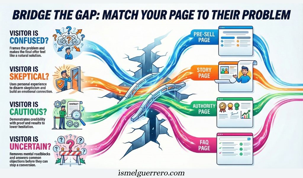
Different Types of Bridge Pages
A bridge page is always built on the same principle: prepare the visitor before the next step. But the way you deliver that preparation depends on what your audience needs most at the moment they arrive.
| Types | Purpose | Why It Works | Best Used For |
|---|---|---|---|
| Pre-Sell Bridge Page | Frames the problem and sets up the solution before the visitor hits the offer. | Closes the gap between curiosity and relevance, making the destination page feel natural. | Cold audiences who might be confused or resistant if sent straight to a sales page. |
| Story Bridge Page | Uses a short personal or customer story to connect emotionally. | People trust human experience; stories disarm skepticism and create relatability. | Situations where trust is low or the audience has seen too much hype. |
| Value Bridge Page | Delivers a quick win (tip, checklist, video, or resource) before asking for action. | Reciprocity. By giving value first, visitors are more open to give attention or trust in return. | Audiences comparing multiple options or those who expect proof of expertise. |
| Authority Bridge Page | Demonstrates credibility through results, proof, or credentials. | Proof lowers hesitation; authority increases confidence in the next step. | High-ticket, high-stakes, or competitive offers where doubt runs high. |
| FAQ Bridge Page | Answers common objections or questions before the click-through. | Removes uncertainty and clears mental roadblocks that stop conversions. | Complex offers, costly decisions, or situations with frequent buyer hesitation. |
Key Insight
The type of bridge page you choose depends on the gap you need to close:
- Confusion → Pre-sell
- Skepticism → Story
- Caution → Authority
- Uncertainty → FAQ
- Demand for proof → Value
That alignment matching the format to the visitor’s state of mind is what makes a bridge page effective.
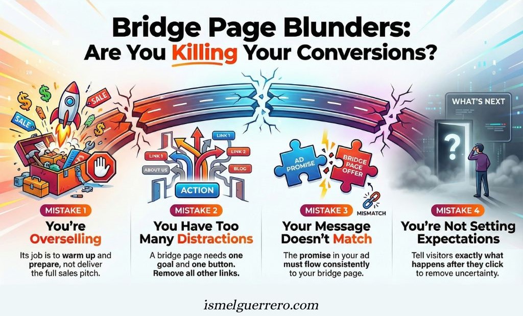
Common Mistakes to Avoid with Bridge Pages
Bridge pages are simple in concept, but easy to misuse in execution. When they’re rushed, overloaded, or misaligned, they don’t just fail to help. They actively work against conversion by introducing confusion or eroding trust.
Here are the most common mistakes to avoid, and why they matter.
1. Overselling Before the Offer
A bridge page is not the place for a full sales pitch. Its role is to frame and prepare, not to persuade aggressively. When you push too hard too early, visitors feel pressure before they’ve fully oriented themselves.
That pressure often triggers resistance. Instead of moving forward, people pause, question intent, or leave entirely. A strong bridge page builds readiness, not urgency.
If the page feels like it’s trying to close the sale, it’s doing too much.
2. Being Vague or Misleading
A bridge page should reduce uncertainty, not create it. When the message is vague, overly broad, or intentionally ambiguous, visitors don’t know what they’re agreeing to by clicking forward.
Even worse is misalignment. If the bridge page hints at one outcome but the destination delivers something else, trust breaks instantly. Once that happens, conversion becomes unlikely, regardless of how strong the offer is.
Clarity beats cleverness. Preview the next step honestly and directly.
3. Adding Too Many Distractions
Every additional element on a bridge page competes for attention. Navigation menus, extra links, multiple buttons, or unrelated visuals dilute focus and slow decision-making.
A bridge page has a single purpose: guide the visitor forward. Anything that doesn’t support that purpose introduces friction. In many cases, fewer elements lead to better outcomes.
Simplicity is not minimalism for its own sake. It’s intentional focus.
4. Forgetting to Match the Message
Message match is one of the most overlooked factors in funnel performance. Visitors arrive with a specific expectation based on what they clicked. If the bridge page shifts language, tone, or angle too abruptly, it creates cognitive friction.
Even small mismatches can cause hesitation. The bridge page should feel like a natural continuation of the original promise, not a reset or a pivot.
Repeat the core language and intent that earned the click.
5. Not Setting Expectations for What Comes Next
People are more comfortable moving forward when they know what’s coming. A bridge page that fails to explain the next step leaves visitors guessing, and uncertainty often leads to inaction.
This doesn’t require detail. A simple preview of what they’ll see, how long it takes, or what’s required is usually enough to reduce anxiety and encourage progress.
Removing the fear of the unknown is one of the bridge page’s most important jobs.
Bottom Line
The most effective bridge pages are focused, aligned, and intentional. They don’t try to educate fully or persuade aggressively. They do one thing well: prepare the visitor for the next step by creating clarity, continuity, and confidence.
When those elements are present, the rest of the funnel has a much better chance to do its job.
When to Use a Bridge Page (And When to Skip It)
A bridge page is powerful, but it’s not always necessary. Adding extra steps without intention can slow down the user journey. The key is knowing when it makes sense to use one and when to leave it out.
✅ When to Use a Bridge Page
- Cold Traffic: If visitors are coming from ads, search, or social clicks and don’t know you yet, a bridge page gives them context before they see the offer.
- Complex Offers: If the destination page is detailed or requires explanation, the bridge simplifies the handoff.
- Trust Gaps: If the traffic source and destination feel disconnected, the bridge restores alignment and prevents drop-off.
- High-Ticket or High-Stakes Offers: The bigger the decision, the more framing is needed. A bridge page adds reassurance before asking for action.
- Message Transitions: If your ad uses one angle and the offer uses another, a bridge page connects those angles seamlessly.
❌ When to Skip a Bridge Page
- Warm Audiences: If visitors already know, like, and trust you, an extra page may be unnecessary. Sending them directly can be more efficient.
- Low-Ticket Offers: If the decision is small and friction-free, adding a bridge can feel like an obstacle.
- Clear and Direct Flows: If the traffic source and the offer are already perfectly aligned, a bridge may not add value.
Key Insight: The value of a bridge page comes from solving disconnects. If there’s a gap in trust, clarity, or message match, use one. If the path is already clear and confidence is high, don’t complicate it.
In practice, marketers tend to see the strongest impact from bridge pages with cold traffic and high-consideration scenarios, where the trust gap is naturally wider.
How a Bridge Page Fits Into Funnel Strategy
A bridge page is not a standalone piece. It’s a connector. To understand its value, you need to see where it fits within the flow of a funnel.
At the most basic level, here’s how it looks:
Traffic Source → Bridge Page → Destination Page (sales, sign-up, or content)
The bridge sits in the middle, creating continuity between the promise that made someone click and the page where action happens.
Where It Belongs in a Funnel
- Between Ads and Offers: Ads often make bold promises. The bridge explains those promises and ensures the offer feels like the logical next step.
- After an Opt-In: Instead of dropping someone directly onto a thank-you page, a bridge can prepare them for what comes next (like a webinar, demo, or special offer).
- Between Free Content and Paid Offers: A blog post or video attracts attention, but a bridge is what smoothly transitions that attention into a commercial opportunity.
How It Differs from Other Pages
- Not a Landing Page: A landing page collects information (like an email address). A bridge page doesn’t collect, it prepares.
- Not a Thank-You Page: A thank-you page confirms an action. A bridge page sets up the action that’s about to come.
- Not a Sales Page: A sales page persuades directly. A bridge page introduces, frames, and guides into that persuasion.
Example Funnel Flows
With a Bridge Page: Ad → Bridge Page (context + trust) → Sales Page → Conversion
Without a Bridge Page: Ad → Sales Page → High bounce rate, lower conversions
The difference is subtle in structure, but powerful in impact. A well-placed bridge makes the journey feel natural, logical, and trustworthy all of which drive action.
Key Insight: A bridge page doesn’t replace the other parts of your funnel. It enhances them by closing the gaps between steps. The stronger the bridge, the smoother the path and the higher the conversion rate.
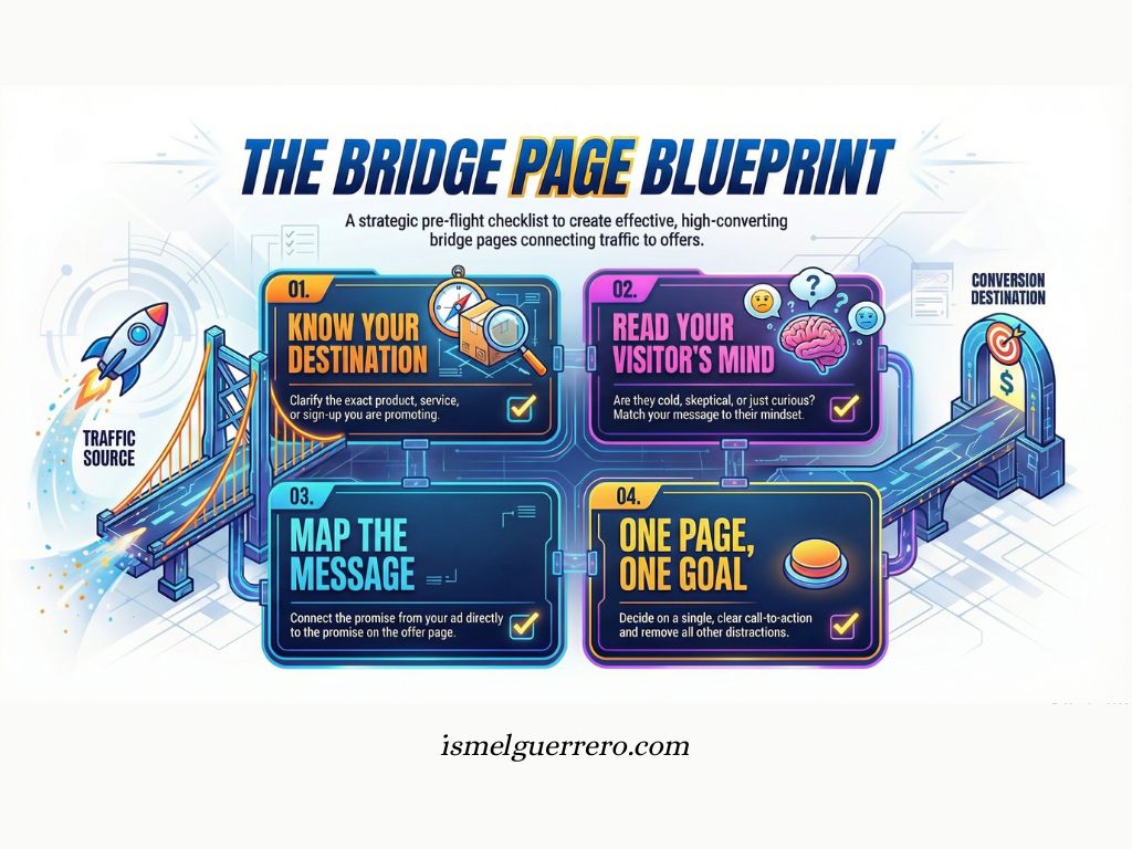
Next Steps Before You Build One
A bridge page only works when it’s built with purpose. Before you open a page builder or write a headline, lay the groundwork. These steps ensure the page is clear, relevant, and ready to convert.
1. Clarify Your Offer
Know exactly what you’re sending visitors to. Is it a product, a service, a sign-up, or a piece of content? The more specific the destination, the easier it is to frame it properly.
2. Define Your Audience
Ask yourself: What state of mind will visitors be in when they land here? Cold? Skeptical? Curious? Ready but cautious? This tells you what type of bridge page to build.
3. Decide on the Format
Will your bridge page rely on a short video, a written message, or a mix of both? Choose the format that makes it easiest to connect with your audience in the fewest words.
4. Map the Message
Write down the promise made in your ad, post, or content then write down the promise on your destination page. Your bridge page must connect those two promises without breaking the flow.
5. Keep the Call to Action Simple
A bridge page has one job: move people forward. Decide on a single call to action, phrase it clearly, and remove distractions that could dilute focus.
6. Plan for Testing and Refinement
No page is perfect on the first try. Track how many people click through, how long they stay, and whether conversions improve. Be ready to adjust headlines, video length, or proof elements.
Key Insight: A bridge page isn’t about design tricks. It’s about clarity and alignment. If you understand your offer, your audience, and the gap between them, the bridge will practically build itself.

Conclusion
A bridge page may be small, but the role it plays is huge. It takes visitors who would otherwise arrive cold, confused, or skeptical, and prepares them to take action.
Without it, funnels leak. Promises break. Conversions stall.
With it, the journey feels natural. The message stays consistent. And the likelihood of someone clicking through and converting generally improves.
The lesson is simple: every click needs context. Every visitor needs confidence. And the bridge page is the tool that delivers both.
If your traffic isn’t converting the way it should, don’t just look at the offer. Look at the space before the offer. That’s where the bridge belongs.
Author’s Perspective: Why the Bridge Page Matters
When I started, I thought the bridge page was just extra work. Why add another step when the affiliate link is right there? That shortcut taught me fast: skipping the bridge means skipping the trust.
Because here’s the thing most people don’t realize: people don’t buy from links, they buy from people. If all you ever do is send traffic straight to a sales page, you’re invisible. You blend in with every other affiliate pushing the same offer. But the moment you use a bridge page, you show up. You put your voice in the middle. You take ownership of the message instead of letting the company do all the talking.
That’s why I see the bridge page as more than just “another page.” It’s where you prove you’re different. It’s where trust starts. And without trust, nothing works.
Frequently Asked Questions About Bridge Pages
Do I really need a bridge page in my funnel?
Not always. A bridge page is most useful when you’re sending cold traffic, introducing a complex offer, or dealing with skeptical audiences. If the path is already clear and trust is established, you may not need one.
How is a bridge page different from a landing page?
A landing page is built to drive an action, for example an email opt in, registration, or purchase. A bridge page focuses on connection and context, aligning the message with the click source and setting expectations for the next page.
Can I use a bridge page for any type of offer?
Yes, but the value depends on the situation. The more context, trust, or explanation your audience needs before taking action, the more powerful a bridge page becomes.
Will adding a bridge page hurt my conversions by adding an extra step?
Not if it’s done right. A bridge page reduces friction by making the journey feel natural. Instead of slowing visitors down, it increases the likelihood that they’ll continue because they feel guided and informed.
What should I put on a bridge page?
Keep it simple: a clear headline, a short message or video, a preview of what’s next, and one call to action. Optional elements include proof, a story, or answers to common objections.
How do I know if my bridge page is working?
Track click-through rate to the next step and downstream conversions. If visitors are clicking through and conversions improve compared to direct traffic, your bridge page is doing its job.
0 Comments