Introduction
Most online businesses lose potential customers before the offer even gets a chance. People click, land on a page they don’t connect with, and disappear in seconds.
Bridge pages are built to solve that problem. They act as the step between an ad or traffic source and the main offer, giving visitors the context, trust, and motivation they need to move forward.
This article brings together some of the most effective bridge page examples available today. You’ll see how this simple page type can shape the customer journey, why it’s such a powerful tool for conversions, and what to focus on when creating your own.
Key Takeaways
Bridge Page Examples You Can Model
- These examples give you practical blueprints you can model instead of guessing.
- The 10 examples in this guide from pre-sell pages to quizzes, videos, and hybrids — show different ways to warm up visitors and increase conversions.
- Choosing the right type of bridge page depends on your traffic source, your offer, and your audience’s stage of awareness.
- Avoid common mistakes like overcomplicating, copying without adapting, or ignoring compliance — these errors cost conversions and can even get your ads banned.
- Use these examples as a starting point, but adapt them to your business so they feel authentic, valuable, and aligned with your brand.
Disclaimer: I am an independent Affiliate. The opinions expressed here are my own and are not official statements. If you follow a link and make a purchase, I may earn a commission.
Bridge Page Examples That Work in 2025
A good bridge page doesn’t just fill space between an ad and an offer it makes the transition seamless. The best examples follow a clear pattern: they grab attention, warm up the visitor, and hand them over to the offer ready to act.
Below are some of the most effective bridge page examples being used right now. Each one highlights a different approach you can adapt to fit your business, whether you sell physical products, digital offers, or services.
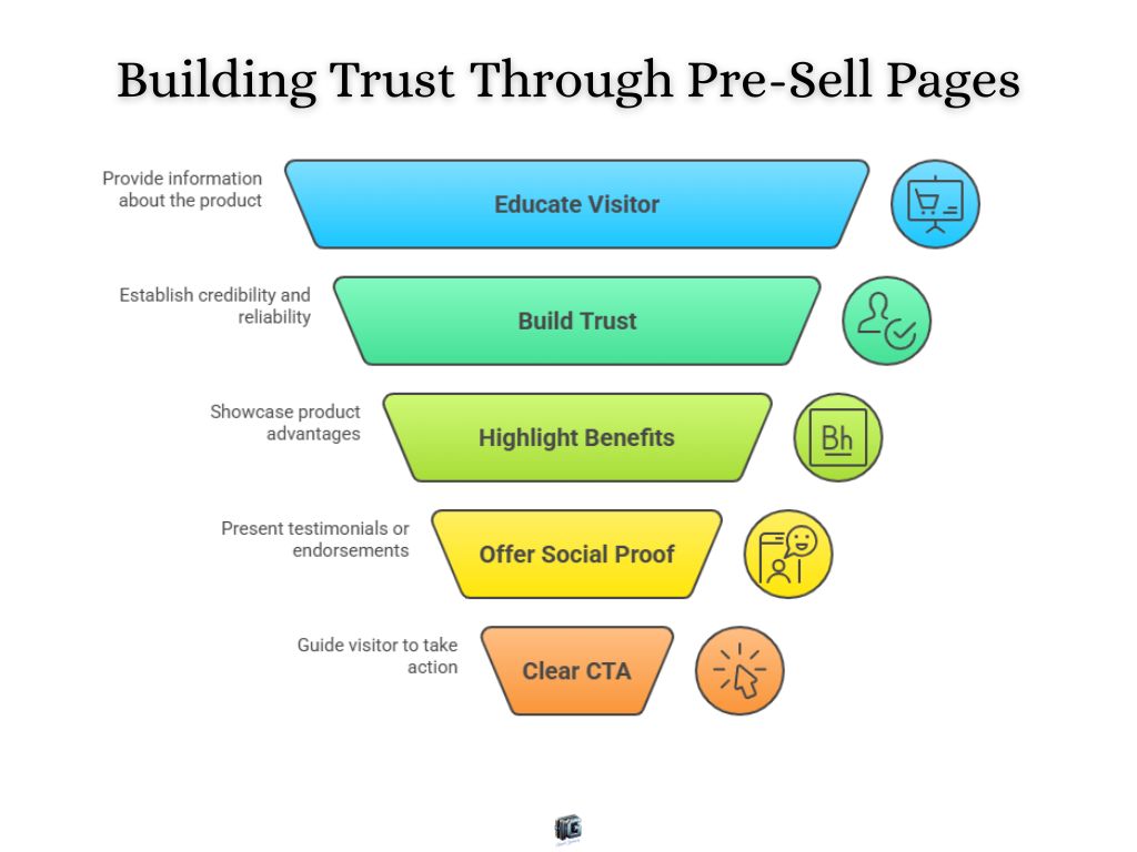
1. Affiliate Pre-Sell Bridge Page Example
Affiliate pre-sell bridge pages are designed to make someone else’s offer feel like the obvious next step. Instead of shoving visitors straight onto a cold affiliate sales page, you create a short piece of content that frames the product, hits on pain points, and builds trust.
Real-world twist: Advertorials and pre-sell reviews are the classic version of this. Think of Zendesk’s PPC ad-to-landing flow: it doesn’t just dump you into a trial sign-up; it educates first, walking you through benefits and use cases before you commit.
Why it works: visitors feel they’re making an informed decision, not reacting blindly to an ad. This style is especially powerful in niches where skepticism runs high.
Focus: Educate the visitor on who you are, what you offer, and why the product solves their pain.
Action: Use light social proof, keep the tone advisory instead of “salesy,” and always end with one clear CTA. Tools like Systeme.io or a simple WordPress blog post are perfect for this format.
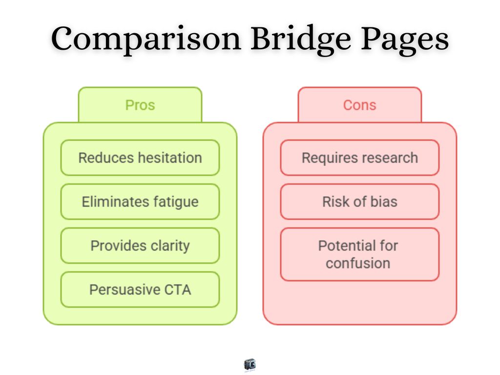
2. Product Comparison Bridge Page Example
Comparison bridge pages win attention by stacking the promoted offer against alternatives. Benefits, features, or pricing are laid out side by side, with your recommendation positioned as the winner.
Real-world twist: Review-style landing pages dominate affiliate funnels. They reduce buyer hesitation by controlling the narrative before prospects can wander off to Google “best [product category].”
Why it works: people crave shortcuts when making buying decisions. A comparison format eliminates decision fatigue and gently nudges visitors toward the choice you’ve already framed as superior.
Focus: Provide context and clarity that helps people see the value gap between options.
Action: Use tables, bullet points, or bold highlights to show differences at a glance, then push your offer as the “no-brainer” pick with a persuasive CTA. Page builders like Elementor or Thrive Architect make creating these comparison tables easy.
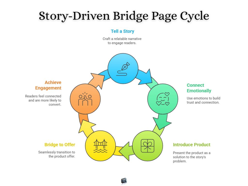
3. Story-Driven Bridge Page Example
Story-driven bridge pages pull readers in with a narrative. It could be a personal transformation, a fictional “what if” scenario, or a customer’s journey and the offer becomes the natural conclusion to the story.
Real-world twist: Fitness and wellness funnels often use this style with short Video Sales Letters (VSLs). A quick story of struggle and breakthrough hooks emotions before introducing the product as the turning point.
Why it works: stories lower resistance. People trust narratives more than raw claims, and they subconsciously insert themselves into the journey.
Focus: Tell a relatable, emotional story that connects pain with solution.
Action: Use video or text to make the narrative personal, then bridge directly into the product as the “happy ending.” A distraction-free builder like Carrd or Leadpages works best here to keep the focus on the story.
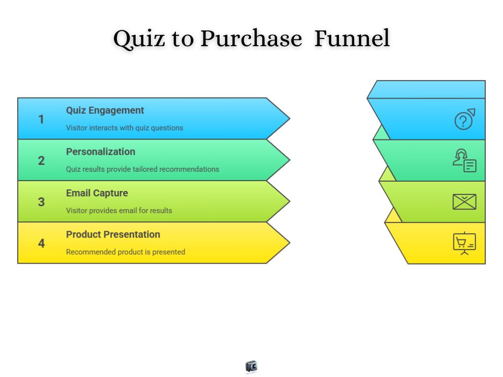
4. Quiz Funnel Bridge Page Example
Quiz bridge pages transform curiosity into commitment. Visitors answer a few questions, and their results reveal the perfect product or service for them.
Real-world twist: Brands like Warby Parker and Undersun Fitness use product recommendation quizzes to segment visitors and guide them to the right solution. Skincare companies like Amelia Gray lean heavily on quizzes because personalization sells.
Why it works: people love personalized results. A quiz creates micro-commitments, builds curiosity, and makes the offer feel custom-made.
Focus: Use short, relevant questions that lead to a logical product fit.
Action: Capture the visitor’s email before showing results, then present the recommended product as the natural solution. Use specialized tools like Typeform or Interact to build the quiz and sync it with your email autoresponder.
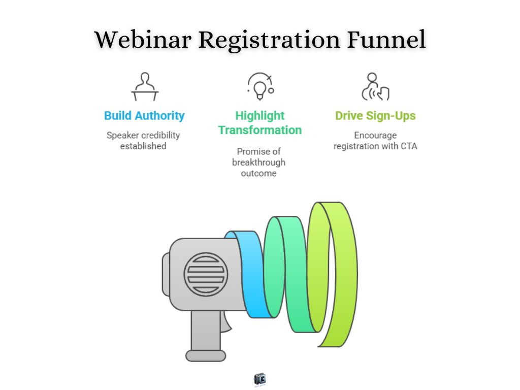
5. Webinar Bridge Page Example
Webinar bridge pages exist to drive sign-ups. They highlight the transformation promise of the event, build authority, and make attendance feel like a must.
Real-world twist: High-ticket funnels rely on webinars to pre-sell. The bridge page is essentially the registration landing page, packed with big promises, speaker credibility, and a frictionless opt-in.
Why it works: webinars build authority and deliver upfront value before pitching. The bridge page’s job is to spark enough curiosity to get people to register and actually show up.
Focus: Position the webinar as the key to a breakthrough outcome.
Action: Use bold headlines, strong social proof, and a single call-to-action: register now. Platforms like WebinarJam or Demio handle the registration page and the webinar hosting seamlessly.
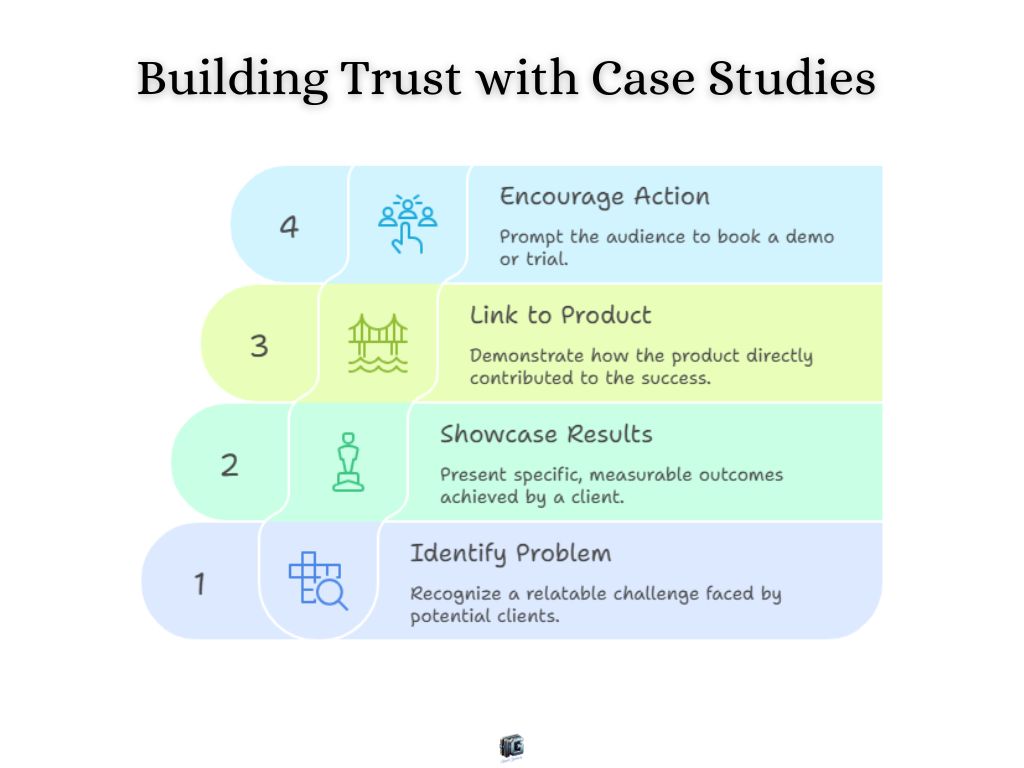
6. Case Study Bridge Page Example
Case study bridge pages build trust with proof before the pitch. They showcase a real-world win and then link that result directly to the product.
Real-world twist: SaaS companies frequently use case study pages to warm up leads. A short story of a client achieving measurable results becomes the bridge to booking a demo or trial.
Why it works: proof converts. People need evidence, not hype. Seeing someone else succeed lowers skepticism and makes the product feel reliable.
Focus: Share specific, measurable results tied to a relatable problem.
Action: Present the outcome first, then show the product as the exact tool that created it. ClickFunnels is ideal here for stacking screenshots and data visualization.
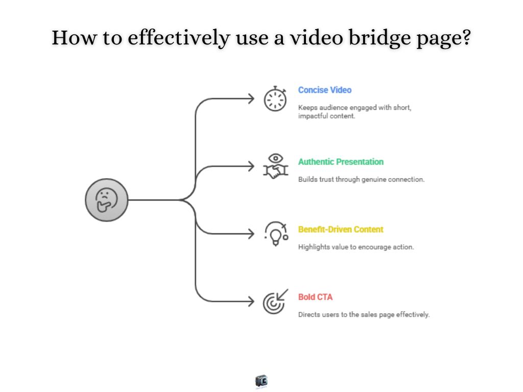
7. Video Bridge Page Example
Video bridge pages are simple but powerful. They feature a short video, often under 3 minutes, that introduces the offer, builds connection, and drives a direct CTA.
Real-world twist: Affiliate funnels use fast VSLs to pre-sell offers. A face-to-camera video or simple animated explainer builds trust quicker than text alone.
Why it works: humans connect with faces and voices. Video makes the recommendation feel personal and trustworthy.
Focus: Keep the video concise, authentic, and benefit-driven.
Action: Pair the video with one bold button that leads directly to the sales page. Host your video on VidUBER or Vimeo (for no ads) and embed it on a simple Systeme.io landing page.
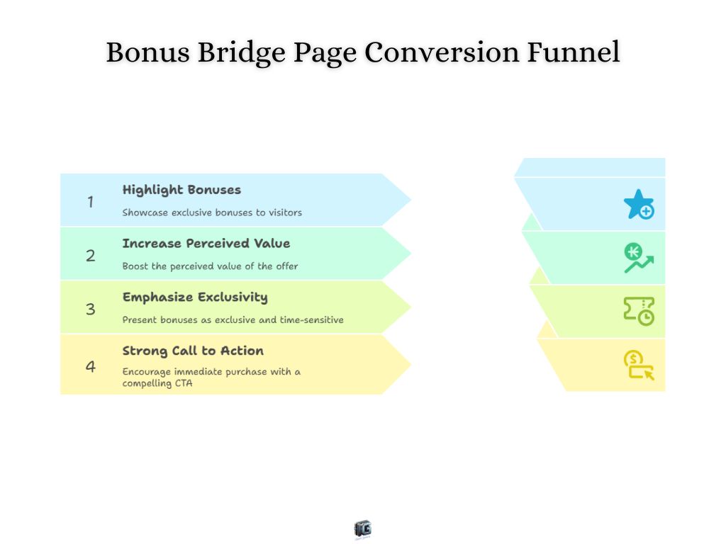
8. Bonus Page Example
Bonus bridge pages sweeten the deal. They highlight exclusive bonuses you’ll deliver if the visitor buys through your link, stacking value until saying no feels painful.
Real-world twist: This is one of the most common affiliate tactics. Marketers offer guides, templates, or discounts on top of the core product as an incentive to purchase through their unique link.
Why it works: perceived value skyrockets when bonuses are added. Visitors feel like they’re getting more than the base offer.
Focus: Clearly outline bonuses and why they matter.
Action: Present bonuses as exclusive and time-sensitive, then drop a strong CTA to lock in the purchase. Create a visual “stack” of your bonuses using Canva, then place the image on your landing page.
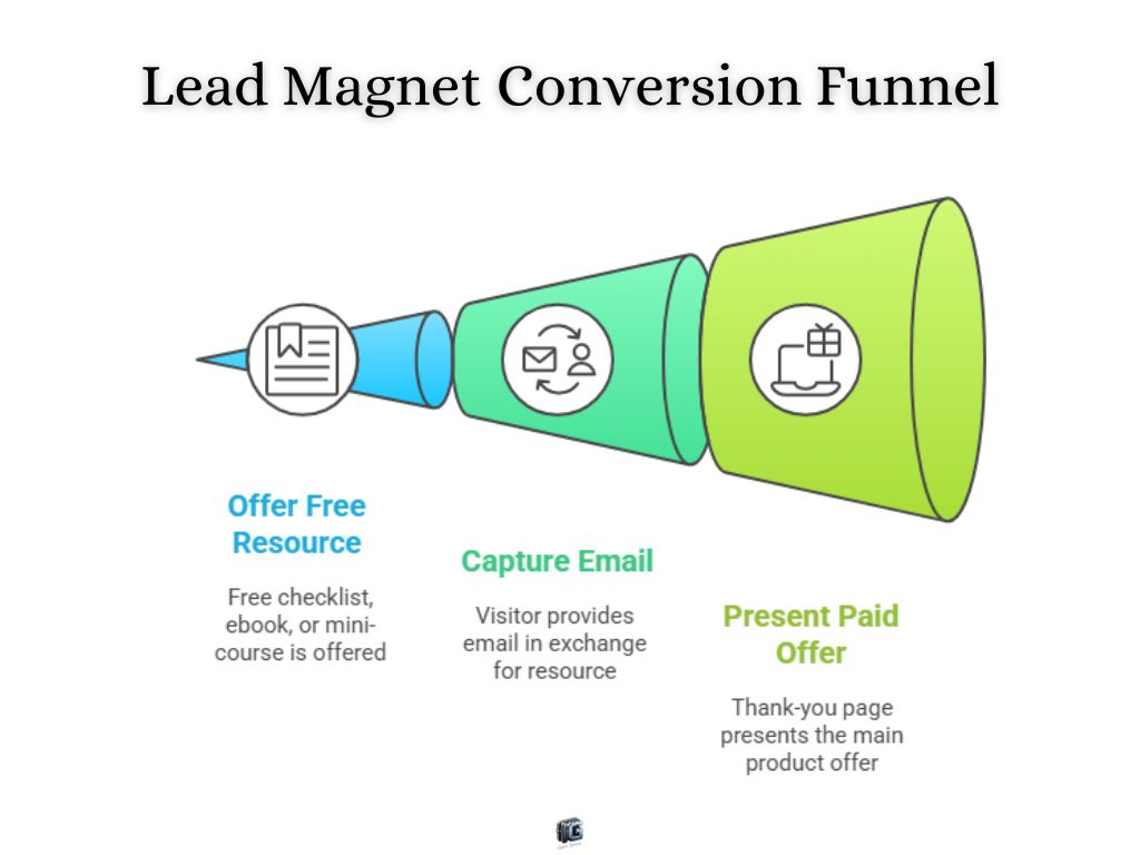
9. Lead Magnet Bridge Page Example
Lead magnet bridge pages use free value to capture attention. A checklist, ebook, or mini-course is offered in exchange for an email, and then the visitor is guided toward the main offer.
Real-world twist: This is a classic squeeze-page funnel. The opt-in page delivers the freebie, and the thank-you page doubles as the bridge by presenting the next paid offer.
Why it works: it lowers the barrier to entry. Even if visitors don’t buy, you’ve earned their trust and gained a way to follow up.
Focus: Make the free resource irresistible and directly tied to the paid offer.
Action: After opt-in, immediately present the product as the advanced solution to the same problem. Email platforms like ConvertKit or AWeber have built-in landing pages that let you set this up in minutes.
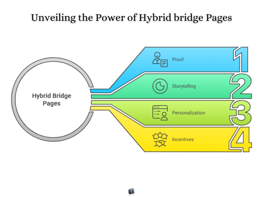
10. Hybrid Bridge Page Example
Hybrid bridge pages mix and match persuasion tactics. Story plus video, case study plus bonuses, quiz plus testimonial, they’re designed to hit multiple psychological triggers at once.
Real-world twist: Many of today’s top-performing “high-converting landing pages” are hybrids. They combine proof, storytelling, personalization, and incentives because no single visitor is persuaded the same way.
Why it works: different people respond to different triggers. A hybrid page stacks the odds in your favor by appealing to logic, emotion, proof, and urgency all at once.
Focus: Blend at least two proven elements without overwhelming the design.
Action: Test variations to see which persuasion combos work best for your audience. Robust builders like Unbounce or ClickFunnels 2.0 allow you to A/B test these complex layouts effectively.
How to Choose From These Bridge Page Examples
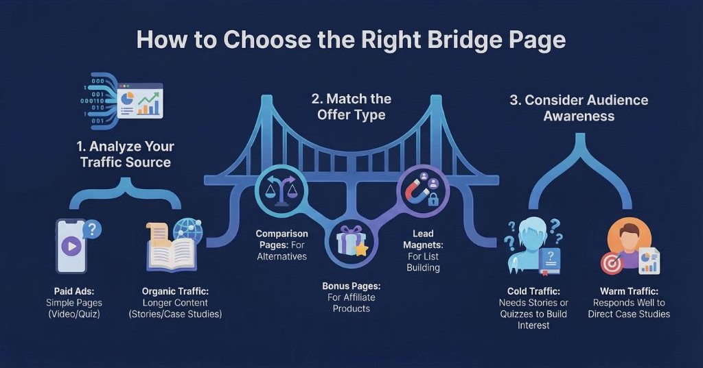
Seeing bridge page examples is helpful, but knowing which one to use in your own business is where the real value comes in. The type of bridge page you choose should always match your traffic, your offer, and your audience’s mindset.
- Start with your traffic source. If you’re running paid ads, keep the bridge page simple and compliant; a short video or a quiz works well. For organic traffic, you can afford longer story-driven or case study pages because visitors already have more patience.
- Match the page to your offer type. A product comparison bridge page works best when visitors are weighing alternatives, while a bonus page makes sense when you’re selling an affiliate product where you want to stand out. Lead magnet bridge pages are ideal when your first goal is to build an email list before selling.
- Think about your audience’s awareness level. Cold traffic often needs a story or a quiz to create interest before moving on. Warmer traffic, such as people coming from your email list, might respond faster to a direct bonus page or a case study.
Choosing the right bridge page isn’t about guessing, it’s about alignment. When the page matches the visitor’s intent and the offer’s promise, conversions naturally increase.
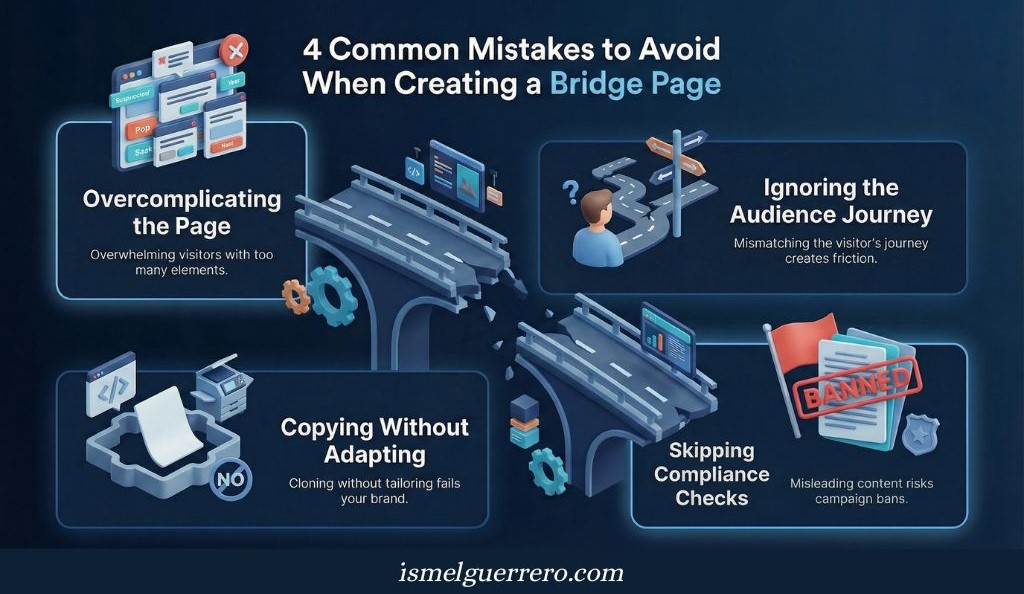
Common Mistakes When Choosing a Bridge Page
Even with strong bridge page examples in front of you, it’s easy to make choices that hurt performance instead of improving it. Here are the most common mistakes entrepreneurs run into when selecting the type of bridge page for their business:
1. Overcomplicating the page.
Adding too many elements, multiple CTAs, or long-winded copy makes the page confusing. A bridge page should simplify the transition, not overwhelm visitors with noise.
2. Ignoring the audience’s journey.
Choosing a story-driven page when your audience wants a quick comparison, or using a long video when people are looking for fast answers, creates friction. Always consider where visitors are in the decision process.
3. Copying examples without adapting.
It’s tempting to duplicate a page you’ve seen work elsewhere, but if you don’t adjust it to your brand voice, audience, and offer, it often falls flat. The best results come from modeling, not cloning.
4. Skipping compliance checks.
Ad platforms are strict. Using aggressive claims, misleading language, or thin content can get your campaigns banned. Choosing the wrong format without compliance in mind creates unnecessary risk.
Avoiding these mistakes is just as important as picking the right type. The goal is not only to increase conversions, but also to create a smooth, trustworthy experience that supports your brand long term.
Compliance: How to Use Bridge Pages Without Getting Banned
One of the fastest ways to kill a campaign is to ignore compliance. Ad platforms like Facebook and Google want to protect users from misleading or “thin” pages, and bridge pages often get flagged if they aren’t set up correctly.
Add genuine value.
Your bridge page can’t just be a blank screen with a single “click here” button. It needs useful content: a story, a comparison, a video, or an explanation that prepares the visitor. Thin pages get rejected quickly.
Stay clear and transparent.
Avoid exaggerated claims, unrealistic promises, or deceptive language. Phrases like “guaranteed results in 24 hours” almost always trigger disapprovals. Keep the messaging truthful and focused on benefits without hype.
Respect ad platform policies.
Different platforms have different hot buttons. Facebook is strict about personal attributes (“Are you overweight?” style headlines), while Google focuses heavily on page quality and relevance. Review the guidelines before launching ads.
Keep branding consistent.
If your bridge page feels disconnected from your offer or ad, platforms may see it as a bait-and-switch. Make sure the design, tone, and messaging flow naturally from ad → bridge → offer.
Compliance isn’t just about keeping ads live. It also builds trust with your audience. When the bridge page feels authentic, transparent, and valuable, conversions rise while risks stay low.
The “Safe Ad” Checklist: Don’t Launch Without These 5 Things
Before you run paid traffic (Facebook, Google, YouTube) to your bridge page, ensure these elements are visible:
| Item | Why It’s Mandatory |
|---|---|
| ✅ Footer Links | You must have functioning links to your Privacy Policy, Terms of Service, and Contact Us pages in the footer. Ad platforms check these bots automatically. |
| ✅ The “Not Facebook” Disclaimer | If running ads on Meta, add this to your footer: “This site is not a part of the Facebook website or Facebook Inc. Additionally, This site is NOT endorsed by Facebook in any way. FACEBOOK is a trademark of FACEBOOK, Inc.” |
| ✅ Income / Health Disclaimers | If you make any claim about money or health results, you must include disclaimer text stating that results are not typical. |
| ✅ Physical Address | A real physical address (or PO Box) in the footer signals to Google and Facebook that you are a legitimate business. |
| ✅ No “Before / After” Zoom-ins | (Health niches) Avoid aggressive zoomed-in photos of body parts. Ad algorithms flag these immediately. Focus on the story, not the skin or body. |
Conclusion
Bridge pages may look simple, but the right one can completely change how your funnel performs. They transform cold clicks into prepared prospects by adding context, trust, and motivation before the offer ever appears.
In this article, you’ve seen a wide range of bridge page examples from pre-sell and comparison pages to quizzes, videos, and hybrids. Each style works for different situations, but the goal is always the same: to guide visitors smoothly toward conversion.
Now it’s your turn. Pick one that fits your business, adapt it to your audience, and put it into play. The sooner you start testing, the sooner you’ll see how powerful this “missing step” can be in your own results.

FAQs About Bridge Page Examples
Are bridge pages legal?
Yes. Bridge pages are legal as long as they provide real value, are transparent, and comply with advertising regulations. Problems arise when pages are misleading, make unrealistic claims, or act as thin “doorway” pages with no substance.
Do bridge pages work for e-commerce?
Absolutely. Many e-commerce brands use quiz funnels, product comparisons, or video bridge pages to prepare shoppers before sending them to a product page. This extra step reduces bounce rates and increases purchase intent.
Can I use a bridge page with Facebook or Google Ads?
Yes, but you must stay within compliance. Both platforms will disapprove or ban campaigns if the page looks deceptive or low quality. The safest approach is to add value: explain, educate, or engage before redirecting to the main offer.
What makes a high-converting bridge page?
A strong bridge page is simple, relevant, and aligned with the visitor’s intent. It removes doubts, highlights benefits, and makes the next step feel obvious. Clear headlines, concise copy, proof elements, and a single call to action are the core ingredients.
Do I always need a bridge page?
Not always. If your audience is already warm (for example, from an email list), you can often send them directly to the offer. But when dealing with cold traffic from ads, a bridge page is one of the most effective ways to increase conversions.
0 Comments