A landing page is a focused web page built to drive one specific action. That action might be signing up, starting a trial, downloading a guide, or purchasing a product. Unlike a homepage, a landing page removes distractions and centers everything around a single goal.
Studying landing page examples is one of the fastest ways to understand what actually drives conversions. Instead of guessing what works, you can observe proven structures, messaging patterns, and design decisions in context.
This article breaks down high-performing landing page examples across different goals and explains exactly why they convert.
Key Takeaways
- High-converting landing pages focus on one clear goal and remove competing distractions.
- Strong headlines communicate value immediately, not features or vague claims.
- Visual hierarchy guides attention from problem to solution to action.
- Social proof reduces hesitation by showing real-world validation.
- Clear calls to action eliminate ambiguity and make the next step obvious.
Disclaimer: I am an independent Affiliate. The opinions expressed here are my own and are not official statements. If you follow a link and make a purchase, I may earn a commission.
What makes a landing page effective?
An effective landing page converts because it reduces confusion. It answers the visitor’s core question quickly: “Is this for me, and what happens if I act?” Every element on the page should support that decision.
Clear value proposition
The headline carries the heaviest weight. It must communicate the primary benefit in plain language. Instead of describing features, it should explain the outcome or improvement the user can expect. Subheadlines then expand that promise with context or clarification.
Clarity beats cleverness here. If a visitor needs to interpret the message, friction increases and conversions drop.
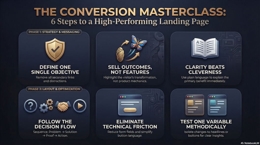
One focused goal
High-performing landing pages commit to a single objective. That objective might be a sign-up, demo request, or purchase. Navigation links, unrelated offers, or secondary calls to action dilute attention and weaken momentum.
Focus creates direction. When the page has one purpose, visitors understand exactly what action to take.
Logical visual hierarchy
Visual hierarchy refers to how layout, size, spacing, and contrast guide attention. Important elements appear first and stand out clearly. Supporting details follow in a natural reading order.
Effective pages typically follow this sequence: Problem → Solution → Proof → Action
That flow mirrors how people make decisions. The structure supports the psychology.
Trust signals
Visitors hesitate when uncertainty exists. Testimonials, client logos, ratings, certifications, or brief case results reduce that uncertainty. These elements act as evidence that the offer works for others.
Trust does not require exaggeration. Specificity and authenticity are more persuasive than bold claims.
Clear call to action
A call to action should describe the next step in concrete terms. “Start Free Trial” is stronger than “Submit.” Specific language lowers cognitive effort and clarifies what will happen after the click.
Placement also matters. Strong pages repeat the call to action at logical intervals, especially after persuasive sections, so the reader never has to search for it.
SaaS landing page examples
Software companies rely heavily on landing pages to generate trials, demos, and subscriptions. Because the product is often intangible, clarity and trust become even more important. Below are several SaaS landing pages that demonstrate strong conversion principles in action.
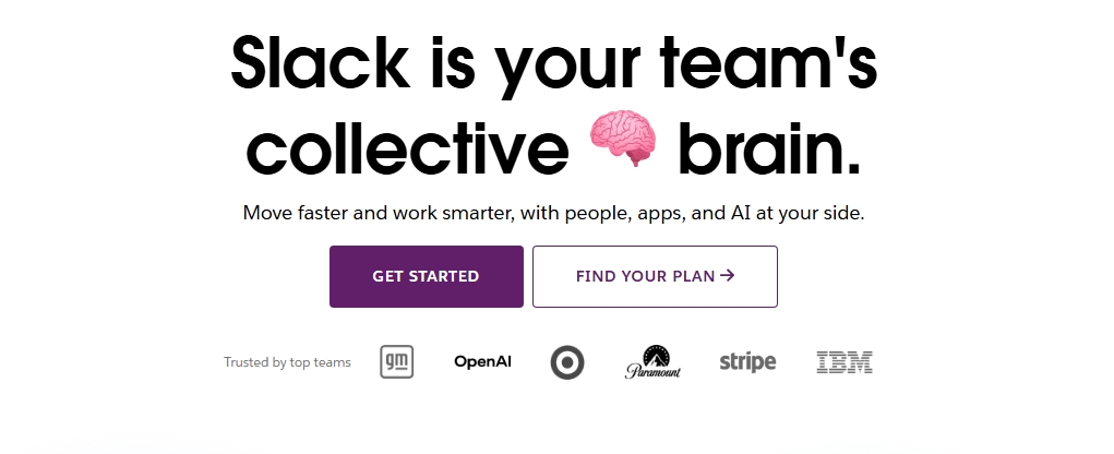
Slack
The landing page for Slack focuses immediately on outcome. The headline emphasizes simpler communication and improved teamwork rather than technical features. Supporting copy explains how teams stay aligned, while product visuals show the interface in context.
Social proof appears early through recognizable brand logos. This signals credibility without overwhelming the page. The primary call to action, “Try for Free,” is clear and low commitment.
Practical takeaway: Lead with the result your product creates, not the mechanics behind it. Demonstrate the product visually, then reinforce trust with recognizable proof.
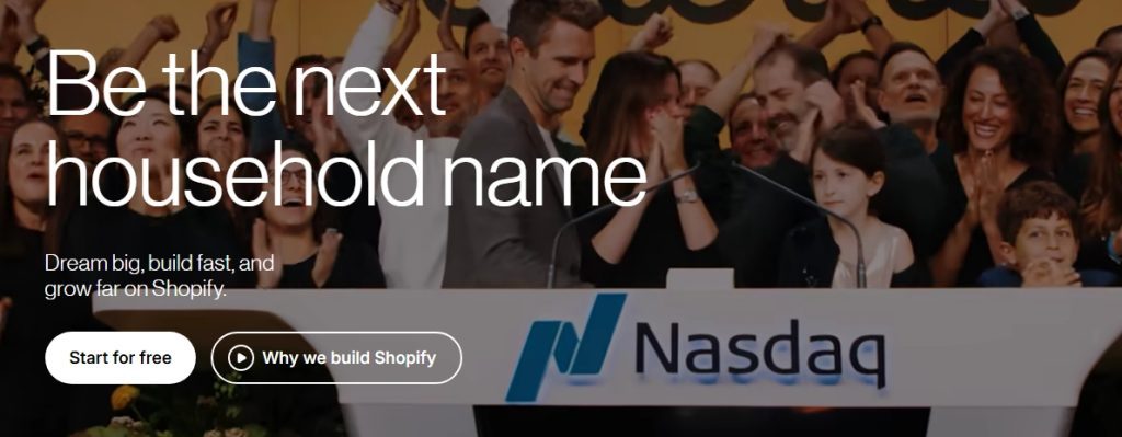
Shopify
Shopify structures its landing page around empowerment. The headline speaks directly to entrepreneurs who want to start or grow a business. Instead of listing technical tools first, the page frames the platform as a pathway to ownership and independence.
The form appears above the fold, reducing friction for users ready to begin. Below that, benefit-driven sections explain how Shopify simplifies payments, shipping, and store management.
Practical takeaway: If your audience has a clear ambition, anchor the page in that aspiration. Then show how your software removes barriers.
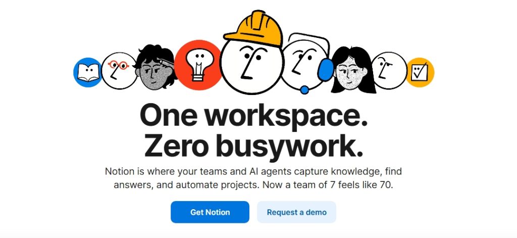
Notion
Notion uses simplicity as a differentiator. The layout feels clean and minimal, which mirrors the product experience. Messaging emphasizes flexibility and customization, appealing to both individuals and teams.
Use cases are segmented clearly, so visitors can identify their scenario quickly. Visual examples show templates in action, making the abstract concept more concrete.
Practical takeaway: When your product is adaptable, help visitors see themselves using it. Segment messaging by user type to reduce cognitive load.
Across these SaaS examples, a pattern emerges. Each page clarifies the outcome, shows the product in context, builds credibility early, and presents a clear next step. None of them rely on hype or vague promises. Conversion comes from focus and relevance.
Ecommerce landing page examples
Ecommerce landing pages operate differently from SaaS pages. The product is tangible, so visuals and purchase clarity matter more than conceptual explanation. At the same time, hesitation is higher because money changes hands immediately. Strong ecommerce landing pages balance persuasion with reassurance.
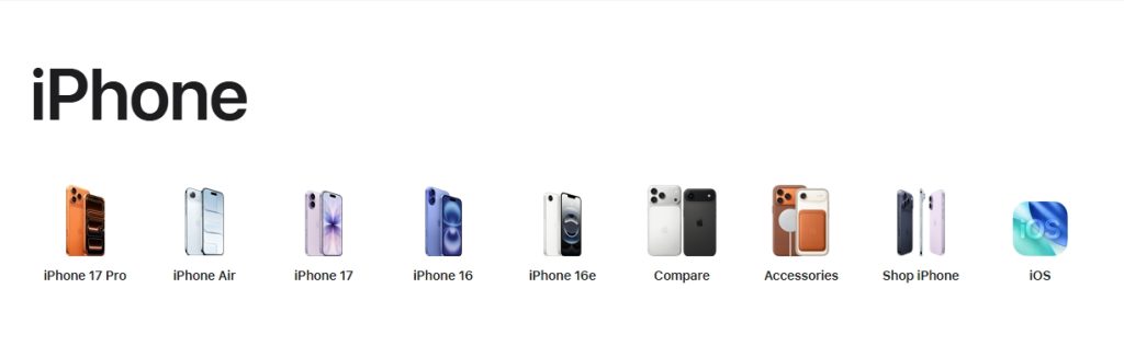
Apple
Apple designs product landing pages with extreme focus. A single product, such as an iPhone or MacBook, receives full visual attention. The headline is short and benefit-driven, often emphasizing performance or innovation in simple language.
Scrolling reveals structured sections that highlight features in digestible blocks. Technical details appear, but they are framed around user experience rather than specifications alone. Calls to action like “Buy” or “Learn more” are consistent and visible throughout.
Practical takeaway: Showcase one product at a time. Use clean sections to layer benefits gradually instead of presenting all information at once.
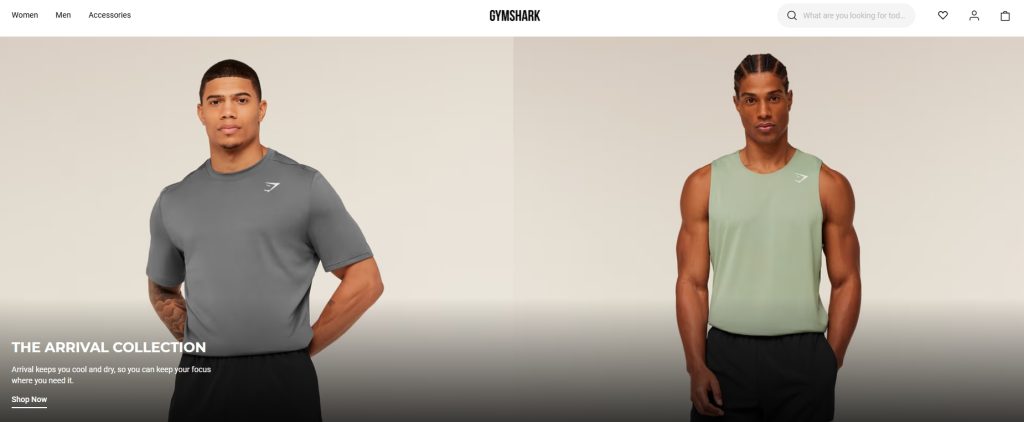
Gymshark
Gymshark builds landing pages around lifestyle identity. Product imagery shows real people in motion, reinforcing the brand’s positioning. Urgency elements, such as limited drops or low-stock indicators, add subtle pressure without aggressive language.
Customer reviews appear near purchase buttons, reducing last-minute doubt. Size guides and shipping details are easy to access, which lowers friction during checkout.
Practical takeaway: Combine aspiration with reassurance. Inspire the buyer visually, then remove practical concerns before they block the purchase.
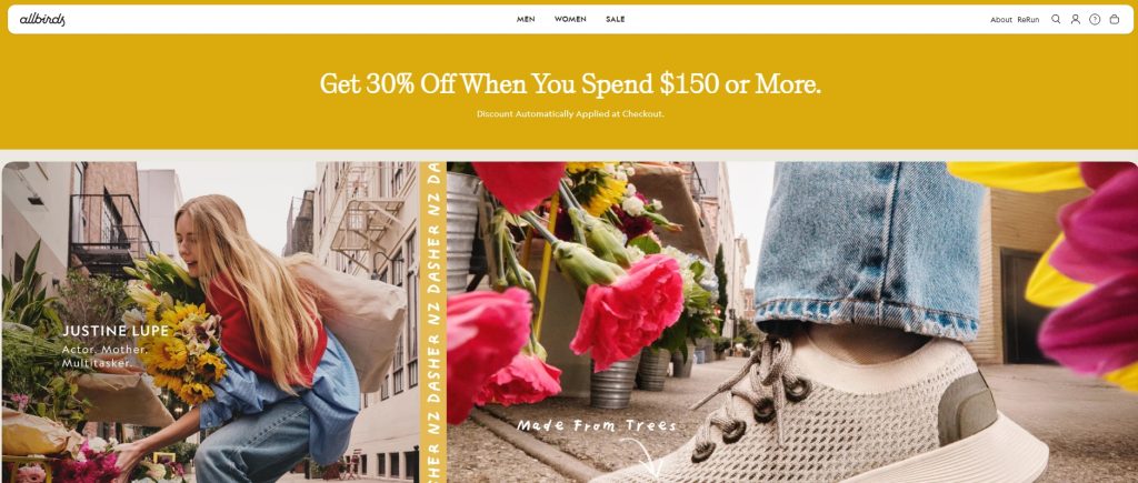
Allbirds
Allbirds centers its landing pages on simplicity and sustainability. Messaging highlights comfort and eco-friendly materials in plain terms. Instead of overwhelming the visitor with options, the page guides them through a structured buying path.
Icons and short benefit statements communicate value quickly. Transparency around materials and environmental impact builds trust with ethically motivated buyers.
Practical takeaway: If your product has a clear differentiator, such as sustainability, make it central. Reinforce it consistently across visuals and copy.
Across these ecommerce examples, one principle stands out. Strong product landing pages reduce decision fatigue. They narrow attention, emphasize benefits visually, and address objections before they surface.
Lead generation landing page examples
Lead generation landing pages have a narrower objective than ecommerce or SaaS trial pages. Their goal is to capture contact information in exchange for something valuable, such as a guide, consultation, webinar, or assessment. Because the reward is often intangible, clarity and trust are essential.
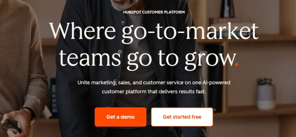
HubSpot
HubSpot frequently uses focused landing pages to promote downloadable resources and tools. The headline typically names the asset clearly, such as a guide or template, and explains the outcome the reader will gain.
The form appears prominently, often beside benefit-driven bullet points that describe what the user will learn. Copy remains concise, which keeps attention on the exchange taking place.
Practical takeaway: State the value of the resource plainly and position the form near that explanation. Make the trade feel worthwhile and transparent.
Neil Patel
Neil Patel uses minimalist lead generation pages centered around a single promise, such as increasing website traffic. The design is simple, often featuring one input field and a bold call to action.
Credibility is reinforced through social proof, media mentions, or client logos. The page avoids unnecessary navigation, which keeps the visitor focused on completing the form.
Practical takeaway: Reduce the number of fields to the minimum required. Every additional field increases friction and lowers completion rates.
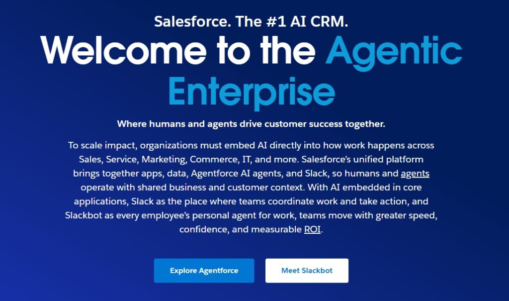
Salesforce demo page
Salesforce structures its demo request landing pages around authority and reassurance. Messaging emphasizes measurable business outcomes, while testimonials and enterprise client logos support credibility.
The form is longer than typical consumer lead pages because the target audience expects a more formal process. However, the layout guides the user step by step, preventing overwhelm.
Practical takeaway: Match form length to audience expectations. Business buyers tolerate more detail when the perceived value is high.
Across these lead generation examples, a consistent pattern appears. The page defines a clear exchange, explains the benefit of providing information, and reduces uncertainty through proof. Success comes from clarity, not clever wording.
How to apply these patterns to your own landing page
Strong examples are useful only if you translate them into deliberate action. Instead of copying layouts, focus on the principles behind them. The goal is not to replicate design, but to clarify your message and reduce friction.
Define your single objective
Start by identifying the one action that matters most. That action might be a purchase, a trial signup, or a consultation request. Everything on the page should support that outcome.
When multiple goals compete for attention, performance weakens. Remove secondary links or offers that distract from the primary conversion path.
Clarify the outcome, not the feature
Review your headline first. Ask whether it explains what changes for the visitor after they act. If the wording focuses on product features alone, revise it to highlight results or benefits.
Specific language builds confidence. Vague claims introduce doubt.
Structure your page around decision flow
Organize content in a logical sequence:
Problem → Solution → Proof → Action
This mirrors how people evaluate offers. Each section should answer the next natural question in the visitor’s mind. Avoid adding sections that do not move the decision forward.
Reduce friction deliberately
Audit your form fields, buttons, and layout. Remove unnecessary inputs. Simplify button language so the next step is obvious. Ensure key trust signals appear before the primary call to action.
Small reductions in friction can produce measurable improvements over time.
Test one variable at a time
After launching the page, test changes methodically. Adjust headlines, call-to-action language, or proof placement individually. Measuring one variable at a time produces clearer insights than changing everything at once.
Consistency and clarity outperform constant redesigns.
Conclusion
Landing page examples are valuable because they reveal structure, not style. When you look closely, high-converting pages share the same foundations: a clear promise, focused design, visible proof, and an obvious next step. Differences in branding or layout matter less than clarity of intent.
Effective landing pages guide a decision. They anticipate hesitation, answer questions in sequence, and reduce friction at critical moments. Nothing appears by accident. Each section supports the single action the page is built to drive.
If you want stronger performance, begin with clarity rather than redesign. Refine your value proposition. Simplify your structure. Strengthen proof where doubt may exist. Then test deliberately and measure results over time.
Conversion is rarely about dramatic change. It is usually about removing confusion and reinforcing relevance.

Frequently Asked Questions
What is the difference between a homepage and a landing page?
A homepage serves multiple purposes. It introduces a brand, offers navigation paths, and supports different types of visitors. A landing page, by contrast, focuses on one specific action and removes unrelated links or distractions. Its structure is intentionally narrow to increase conversion clarity.
How long should a landing page be?
Length depends on the complexity of the offer and the level of trust required. Simple consumer offers may convert with shorter pages, while higher-priced or B2B services often require more explanation and proof. The right length is the amount needed to answer objections before the call to action.
Do landing pages need navigation menus?
In most cases, no. Removing navigation keeps attention on the primary objective. However, certain industries may require access to legal pages or brand credibility links. When navigation is included, it should not compete visually with the main action.
What conversion rate is considered good?
Conversion rates vary by industry, traffic source, and offer type. Many businesses see rates between 2 – 5 percent, though performance can be higher or lower depending on audience alignment and traffic quality. The most useful benchmark is your own historical performance and steady improvement over time.
0 Comments