Introduction
Most websites leak attention within seconds. Visitors arrive, scroll once, and vanish without taking action. The reason is simple: the page they land on isn’t designed to guide them toward a specific goal.
A landing page fixes that problem. It’s a standalone page built with one purpose in mind to convert. Whether the goal is collecting leads, selling a product, or driving sign-ups, every element on a landing page exists to move the visitor closer to that action.
In this guide, you’ll learn exactly what a landing page is, why it matters, and how to use it to increase conversions in your business. We’ll cover the different types of landing pages, show how they’re structured, share best practices, and highlight common mistakes to avoid.
By the end, you’ll have a clear framework for creating landing pages that don’t just attract clicks, but turn them into results.
Key Takeaways
- Landing pages work because they focus attention on a single, clearly defined action.
- Removing distractions is one of the most effective ways to improve landing page performance.
- Different landing page formats exist to match different goals, audiences, and traffic sources.
- High-converting landing pages follow a consistent structure built around clarity, proof, and focus.
- Most landing page problems come from unclear messaging, weak headlines, or competing calls to action.
Disclaimer: I am an independent Affiliate. The opinions expressed here are my own and are not official statements. If you follow a link and make a purchase, I may earn a commission.
What Is a Landing Page?
A landing page is a standalone web page created with one goal in mind: to get visitors to take a specific action. That action could be signing up for a newsletter, downloading a free guide, registering for a webinar, or buying a product.
Unlike a website homepage, which acts as a central hub and offers multiple navigation paths (about, products, blog, contact, etc.), a landing page removes all distractions. It doesn’t try to do everything. Instead, it presents a single message, a clear offer, and one call-to-action.
Think of it this way: a homepage is like a map of an entire city, while a landing page is a direct route to one destination. Visitors aren’t asked to explore, they’re guided straight to the next step you want them to take.
This focus is what makes landing pages so powerful. Every element on the page from the headline to the button works together to increase the chances that a visitor will convert.
This isn’t just a design preference. Industry benchmarks consistently show that pages designed around a single goal outperform multi-purpose pages, especially when you are paying for the traffic.
Types of Landing Pages
Landing pages aren’t one-size-fits-all. The type you use depends on your campaign goal, your traffic source, and how ready your audience is to take action.
Below are the most common landing page types with explanations, use cases, and tips on when to choose each.
1. Lead Generation Landing Page
Also known as a “lead capture page,” this type is designed to collect visitor information (usually name and email) in exchange for something valuable. That value could be a free guide, a checklist, a discount code, or access to a webinar.
- Why it works: visitors are more likely to hand over their details when they feel they’re getting something useful right away.
- Best use cases: building an email list, nurturing prospects with future emails, creating a pipeline of leads for a service-based business.
- Pro tip: keep the form short. Every extra field lowers conversion rates.
2. Click-Through Landing Page
A click-through page warms visitors up before sending them to another step, like a checkout page or pricing page. It usually includes persuasive copy, product highlights, or benefits that reduce friction and prepare people to commit.
- Why it works: visitors aren’t always ready to buy immediately. This page gives them the reassurance or context they need before seeing the purchase page.
- Best use cases: e-commerce products, SaaS offers with free trials, or promotions where visitors need context before seeing the price.
- Pro tip: use visuals and bullet points to highlight benefits quickly. The page should build momentum, not slow it down.
3. Sales Landing Page
A sales page is built to close the deal. Unlike a homepage or lead capture page, it provides everything needed to persuade: a strong headline, persuasive copy, proof elements, testimonials, guarantees, and a clear call-to-action. Sales pages can be short or long depending on the offer’s complexity and price.
- Why it works: it removes distractions and presents a single, compelling argument for buying.
- Best use cases: courses, digital products, services, or higher-ticket items that require more explanation.
- Pro tip: include proof elements (case studies, reviews, logos of past clients) to increase trust.
4. Squeeze Page
A squeeze page is a minimal, laser-focused variation of the lead gen page. It usually has just a headline, a line or two of copy, and an email form. The goal is to “squeeze” one piece of information, usually an email address.
- Why it works: simplicity. There’s nothing else to do but submit the form.
- Best use cases: offering a high-value freebie like an ebook, discount code, or quick-start guide.
- Pro tip: use scarcity or urgency (like “Download today only”) to boost sign-ups.
5. Splash Page
A splash page is an entry page visitors see before accessing the main website or content. It’s often used for announcements, promotions, or gating content. Unlike other landing pages, a splash page may not always be about conversion but it can still direct traffic strategically.
- Why it works: it focuses attention immediately on a single message.
- Best use cases: announcing events, highlighting a new product, confirming age restrictions (for alcohol, gaming, etc.), or promoting seasonal campaigns.
- Pro tip: keep splash pages short and visually strong. They’re designed to interrupt, not to explain.
Note: Use splash pages sparingly. Google can penalize sites that use aggressive interstitials that block content.
6. Thank You Page
A thank you page appears after someone takes the desired action (like submitting a form or completing a purchase). While many businesses treat this as a dead end, smart entrepreneurs use it to deepen engagement.
- Why it works: the visitor is already engaged, it’s the perfect time to suggest the next step.
- Best use cases: delivering promised content (like a freebie), offering an upsell, inviting to a referral program, or encouraging a social share.
- Pro tip: never leave a thank you page blank. Always include a next step to keep momentum going.
By understanding the different landing page types, you can choose the one that fits your campaign goal instead of defaulting to a generic template. The more precise the match, the higher your conversions.
Landing Page Examples That Convert
Looking at real-world landing page examples is one of the fastest ways to understand what works and why. Each of the examples below highlights a proven approach you can model in your own business.
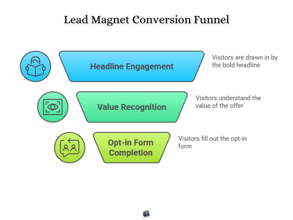
1. Lead Magnet Landing Page Example
A simple page offering a free “Social Media Checklist” in exchange for an email address. The page has a bold headline, a clean design, and a single opt-in form.
- Why it converts: the offer is specific, the value is obvious, and the design removes all distractions. Visitors know exactly what they’ll get and how to get it.
- Takeaway for entrepreneurs: the more specific your free offer, the higher your conversion rate. Generic freebies underperform.
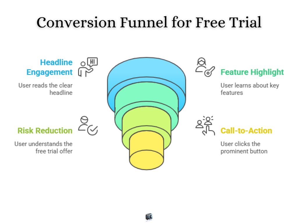
2. Product Trial Landing Page Example
A SaaS company promoting a 14-day free trial of its software. The page uses a clear headline (“Get Started Free”), includes bullet points highlighting features, and finishes with a bright, singular call-to-action button.
- Why it converts: the offer reduces risk by letting people try before they buy. The button stands out and the copy emphasizes ease.
- Takeaway for entrepreneurs: if your product can be sampled, build a landing page that removes fear of commitment.
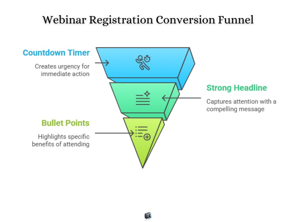
3. Webinar Registration Landing Page Example
A coaching business invites visitors to register for a live training. The page has a countdown timer, a strong headline (“How to Double Your Conversions in 30 Days”), and bullet points summarizing what attendees will learn.
- Why it converts: urgency (the countdown) + specific benefits (what they’ll learn) make signing up feel valuable and time-sensitive.
- Takeaway for entrepreneurs: webinars need urgency and clear benefits focus on what the visitor will walk away with.
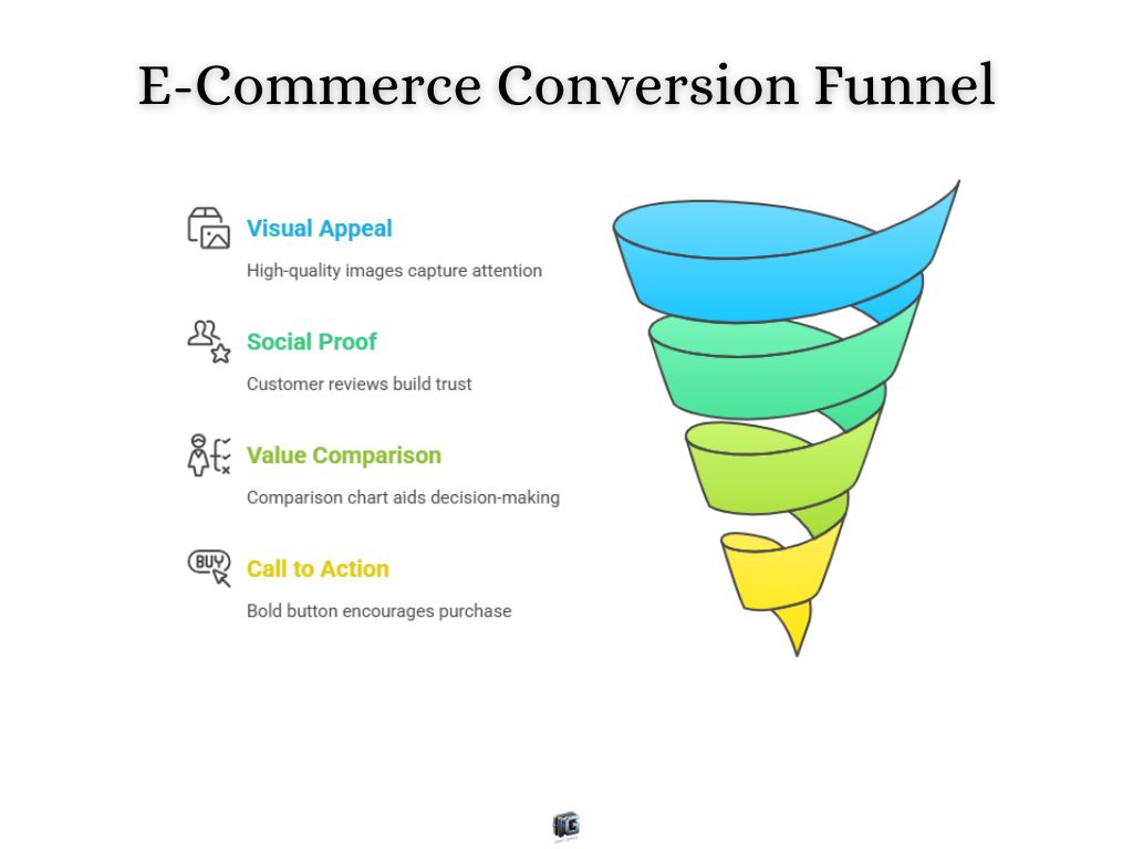
4. E-Commerce Product Landing Page Example
An online store creates a landing page for a single flagship product. The page uses high-quality product images, customer reviews, a comparison chart, and a bold “Buy Now” button.
- Why it converts: social proof builds trust, while visuals show value quickly. The page removes distractions by focusing only on one product.
- Takeaway for entrepreneurs: isolate your top products and create dedicated landing pages for them, instead of sending traffic to a cluttered store.
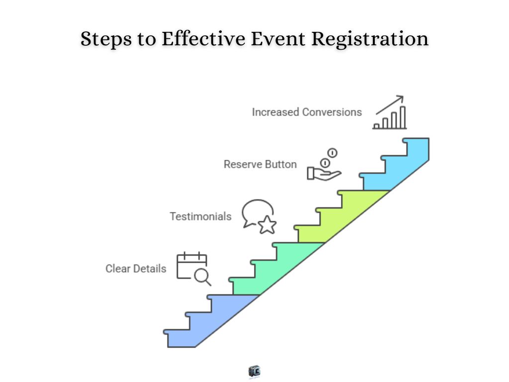
5. Event Registration Landing Page Example
A local business promotes a free in-person workshop. The page includes a headline, event details (date, location, time), testimonials from past attendees, and a simple “Reserve Your Spot” button.
- Why it converts: clear details reduce hesitation, and testimonials show credibility.
- Takeaway for entrepreneurs: always remove uncertainty. If people know exactly what they’re signing up for, conversions rise.
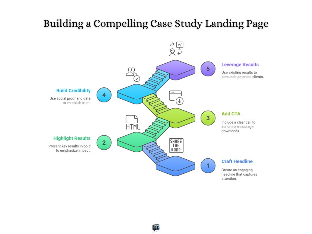
6. Case Study Landing Page Example
A B2B service provider creates a landing page featuring a case study about how they helped a client increase revenue by 40%. The page uses a compelling headline, key results in bold, and a CTA to “Download the Full Case Study.”
- Why it converts: social proof and hard numbers build credibility. Visitors see real-world results instead of promises.
- Takeaway for entrepreneurs: leverage results you already have. Data and stories are more persuasive than features alone.
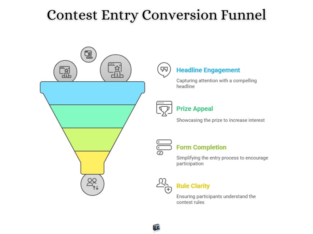
7. Contest or Giveaway Landing Page Example
A brand runs a contest with a simple form: “Enter to win a $250 gift card.” The page includes a headline, prize photo, short form, and clear rules.
- Why it converts: contests create excitement and urgency. A clear prize makes the reward obvious and desirable.
- Takeaway for entrepreneurs: keep entry requirements simple. The fewer steps, the higher the participation.
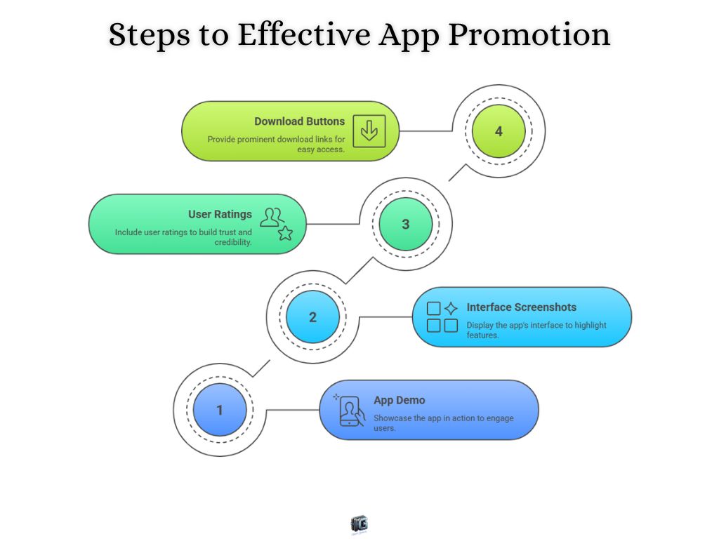
8. Mobile App Download Landing Page Example
An app developer promotes a fitness app with a landing page featuring a large app demo, screenshots of the interface, user ratings, and two buttons: “Download on iOS” and “Get it on Google Play.”
- Why it converts: visuals show the app in action, while ratings add instant credibility.
- Takeaway for entrepreneurs: if you’re promoting an app, show what it looks like and make download links impossible to miss.
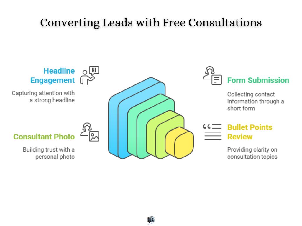
9. Free Consultation Landing Page Example
A consulting firm offers a “Free 30-Minute Consultation.” The landing page includes a strong headline, a short form, a photo of the consultant, and bullet points about what the call covers.
- Why it converts: personal connection (photo) + no-risk offer (free) makes it easy to say yes.
- Takeaway for entrepreneurs: if you’re selling expertise, a free call can be your strongest conversion tool.
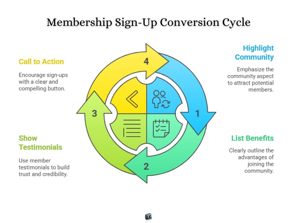
10. Membership Sign-Up Landing Page Example
An online community promotes a membership with exclusive resources. The page uses a headline (“Join 5,000+ Entrepreneurs Inside”), bullet points listing member benefits, testimonials, and a clear “Join Now” button.
- Why it converts: community + exclusivity creates fear of missing out. Testimonials add proof that it’s worth joining.
- Takeaway for entrepreneurs: highlight the community aspect and benefits of belonging, not just features.
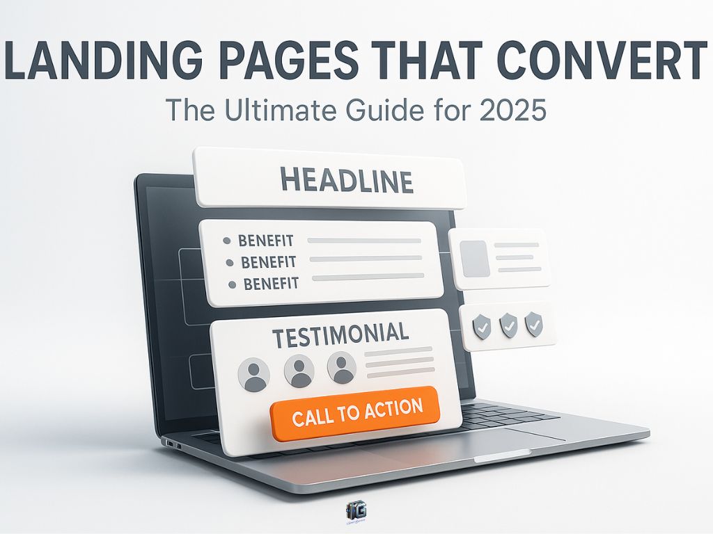
Anatomy of a High-Converting Landing Page
A landing page is only as strong as the elements it’s built from. While designs vary, high-converting pages share a consistent structure that guides visitors from first impression to final click.
Here are the essential parts of a landing page and how to make each one work for you.
1. Headline
Your headline is the first thing visitors see, and it decides whether they keep reading. A strong headline makes a clear promise or highlights a benefit that speaks directly to the visitor’s needs.
- Tip: clarity beats cleverness. “Get 50% More Leads in 30 Days” will outperform a vague headline every time.
2. Subheadline
The subheadline supports the main headline by adding detail or context. It reassures visitors that they’re in the right place and gives them a reason to keep going.
- Tip: use it to explain “how” or “why” the promise in the headline is possible.
3. Visuals (Images or Video)
Visuals bring your message to life. Product photos, explainer videos, or even mockups help visitors understand what they’re getting.
- Tip: use visuals that show the product in use or highlight the transformation, not just logos or stock photos.
4. Value Proposition
This is the heart of the page. It explains what the offer is and why it’s valuable. It should answer the question: “What’s in it for me?”
- Tip: keep it visitor-focused talk about benefits, not just features.
5. Proof Elements
People trust people. Testimonials, case studies, star ratings, or client logos reassure visitors that others have already taken this step successfully.
- Tip: place proof near the call-to-action to ease last-minute doubts.
6. Call-to-Action (CTA)
The CTA is where conversions happen. Whether it’s a button, a form, or both, it needs to be clear, visible, and irresistible.
- Tip: make your CTA specific: “Start My Free Trial” works better than “Submit.”
7. Supporting Copy
Some visitors need more than a headline and button. Supporting copy explains benefits, addresses objections, and adds detail without overwhelming.
- Tip: use short paragraphs or bullet points for easy scanning.
8. Minimal Distractions
What makes landing pages effective is what they leave out. Navigation menus, extra links, or unrelated offers distract from the goal.
- Tip: keep the path simple: one page, one message, one action.
When these elements are combined, they create a smooth journey: hook attention, build trust, prove value, and guide the visitor to act.
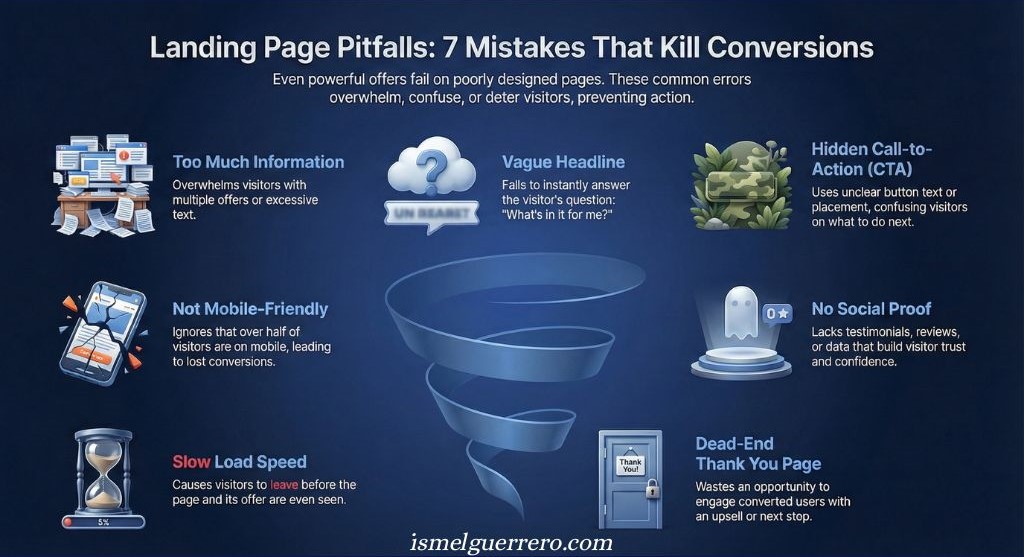
Common Mistakes to Avoid with Landing Pages
Even with a strong offer, the wrong landing page design can tank your conversions. Avoid these common mistakes that turn visitors away before they take action.
1. Overloading the Page with Information
A landing page isn’t a blog post or a homepage. Too much copy, too many sections, or multiple offers overwhelm visitors.
- Fix: keep the focus tight. Stick to one goal and strip away anything that doesn’t move visitors toward it.
2. Weak or Vague Headlines
If your headline doesn’t grab attention or clearly explain what the visitor gets, most people will leave within seconds.
- Fix: make the headline specific and benefit-driven. It should answer “What’s in it for me?” instantly.
3. Confusing or Hidden CTAs
If visitors don’t see what to do next, they won’t act. Buried buttons, generic text (“Submit”), or multiple conflicting CTAs confuse people.
- Fix: use one clear, visible CTA that stands out and tells the visitor exactly what will happen when they click.
4. Ignoring Mobile Optimization
More than half of landing page visits happen on mobile. A page that looks great on desktop but breaks on phones will bleed conversions.
- Fix: design mobile-first. Test every landing page on different screen sizes before launching.
5. No Social Proof
Asking someone to act without showing proof is a big mistake. Visitors look for reviews, testimonials, or data to feel safe.
- Fix: include at least one form of social proof, ideally near the CTA.
6. Slow Load Times
If your page takes more than a few seconds to load, visitors bounce before they even see it.
- Fix: compress images, use clean code, and test load speeds with free tools like Google PageSpeed.
7. Treating the Thank You Page as a Dead End
Many businesses stop after the conversion, wasting a chance to keep momentum going.
- Fix: use your thank you page to upsell, cross-sell, or invite referrals.
Avoiding these mistakes ensures that your landing page doesn’t just look good, but actually performs as it should turning clicks into customers.
This aligns with broader usability research, which links unclear headlines and slow load times directly to higher abandonment rates. On mobile devices, where patience is lower, these errors are even more costly.
Landing Page vs Website Homepage
Many entrepreneurs confuse landing pages with website homepages, but they serve completely different purposes.
Key differences between a focused landing page and a general website homepage.
| Feature/Focus | Landing Page | Website Homepage |
|---|---|---|
| Primary Goal | Drive one specific action (sign-up, buy, etc.) | Introduce brand and provide navigation |
| Navigation | None or very limited | Full menu with multiple links |
| Audience Focus | Targeted visitors (from ads, emails, campaigns) | General visitors exploring the business |
| Content Length | Short and focused, only what supports the goal | Broad overview of business, products, blog |
| Design Purpose | Eliminate distractions and highlight CTA | Showcase brand identity and guide browsing |
| Measurement of Success | Conversion rate (how many took the action) | Engagement (page views, time on site, clicks) |
| When to Use | For campaigns: ads, promotions, lead capture | As the main entry point to your website |
The key difference is focus: a landing page is about action, while a homepage is about exploration. Sending ad traffic to a homepage usually dilutes results, while sending it to a focused landing page maximizes conversions.
Marketing performance data backs this up: traffic sent to focused landing pages converts significantly higher than traffic sent to general homepages. When attention is split, results drop.
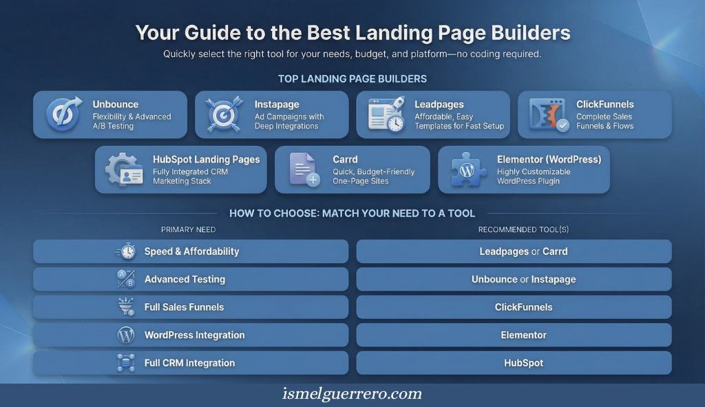
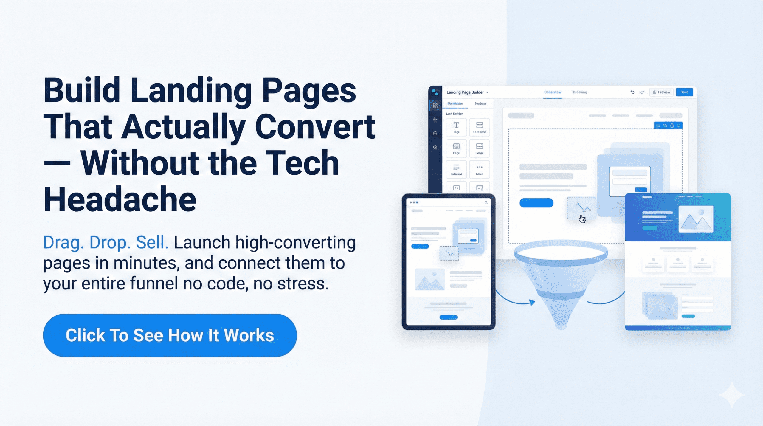
Best Landing Page Builders & Tools
You don’t need to be a developer to create high-converting landing pages. Today’s tools make it simple to design, test, and launch pages quickly.
Top Landing Page Builders and What Makes Them Stand Out
| Tool | Best For | Why It Stands Out | Pricing Model |
|---|---|---|---|
| Carrd | Simple one-page sites | It’s impossible to “break” and sets up in minutes. Perfect for beginners. | Budget King: Free plan available; Pro is only ~$19/year. |
| Elementor | WordPress Users | Integrates seamlessly with your existing site. Highly customizable. | Freemium: Great free version; Pro starts ~$59/year. |
| Leadpages | Small Businesses | Affordable, easy to use, with pre-built templates designed for speed. | Mid-Range: Starts ~$49/mo (often has trials). |
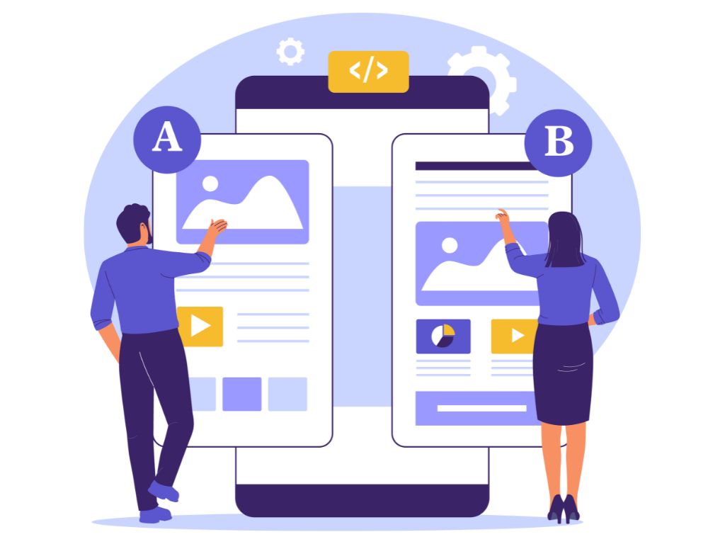
| Unbounce | PPC Marketers | Advanced A/B testing and “Smart Traffic” AI features to boost ad ROI. | Premium: Starts ~$99/mo. |
| Instapage | Agencies / Enterprise | The best design collaboration tools and fastest load speeds for ads. | High-End: Starts ~$199/mo. |
| ClickFunnels | Funnel Builders | More than just pages, it builds checkout flows, courses, and upsells. | Premium: Starts ~$127/mo. |
| HubSpot | CRM Integration | Built right into the CRM, making it great for nurturing leads automatically. | Freemium: Free tools available; upgrades get expensive. |
The right builder depends on your needs:
- If you want speed and affordability → Leadpages or Carrd.
- If you want funnel-building → ClickFunnels.
- If you want advanced testing → Unbounce or Instapage.
- If you’re already on WordPress → Elementor.
- If you need full CRM integration → HubSpot.
Conclusion
Landing pages are one of the simplest but most powerful tools in online business. Unlike a homepage that spreads attention across multiple paths, a landing page focuses on one clear action and that focus is what makes conversions possible.
We’ve broken down what a landing page is, the different types you can use, real-world examples, the anatomy of high-converting pages, and the mistakes to avoid. You’ve also seen the best tools to help you build and test them without needing to code.
The next step is simple: choose the type of landing page that fits your current goal, model proven examples, and launch. Don’t wait for perfection landing pages improve most when you put them into the real world and test.
Every campaign deserves a page built to convert. Start creating yours today, and turn clicks into measurable results.

FAQs About Landing Pages
Are landing pages the same as websites?
No. A website contains multiple pages and navigation, while a landing page is a single, standalone page designed for one conversion goal.
Do I need a landing page if I already have a website?
Yes. Your website is for exploration, but a landing page is for focus. If you’re running ads, promoting a campaign, or collecting leads, a landing page will perform much better than sending visitors to a homepage.
What makes a landing page high-converting?
Clarity, relevance, and simplicity. A strong headline, clear value proposition, compelling proof, and a single call-to-action are the core ingredients.
Can landing pages help SEO?
Yes, but indirectly. Landing pages can be optimized for keywords and used for organic traffic, but their primary strength is conversion. Pairing them with content (blogs, guides) helps with SEO.
How many landing pages should I have?
As many as you need for your offers. The best-performing businesses often have multiple landing pages one for each campaign, product, or audience segment.
Do I need a special tool to create landing pages?
Not always. You can build one with your website platform, but dedicated tools (like Unbounce, Leadpages, or Elementor) make it much easier to design and test high-converting pages.
1 Comment
15 Landing Page Examples That Convert and Why - Ismel Guerrero. · February 15, 2026 at 8:26 pm
[…] landing page is a focused web page built to drive one specific action. That action might be signing up, starting […]