Introduction
Attention online is fragile. Visitors click, scroll, and make split-second decisions about whether to stay or bounce. Sometimes, before they even reach your main content, you need a way to set the tone, capture attention, or filter who gets through.
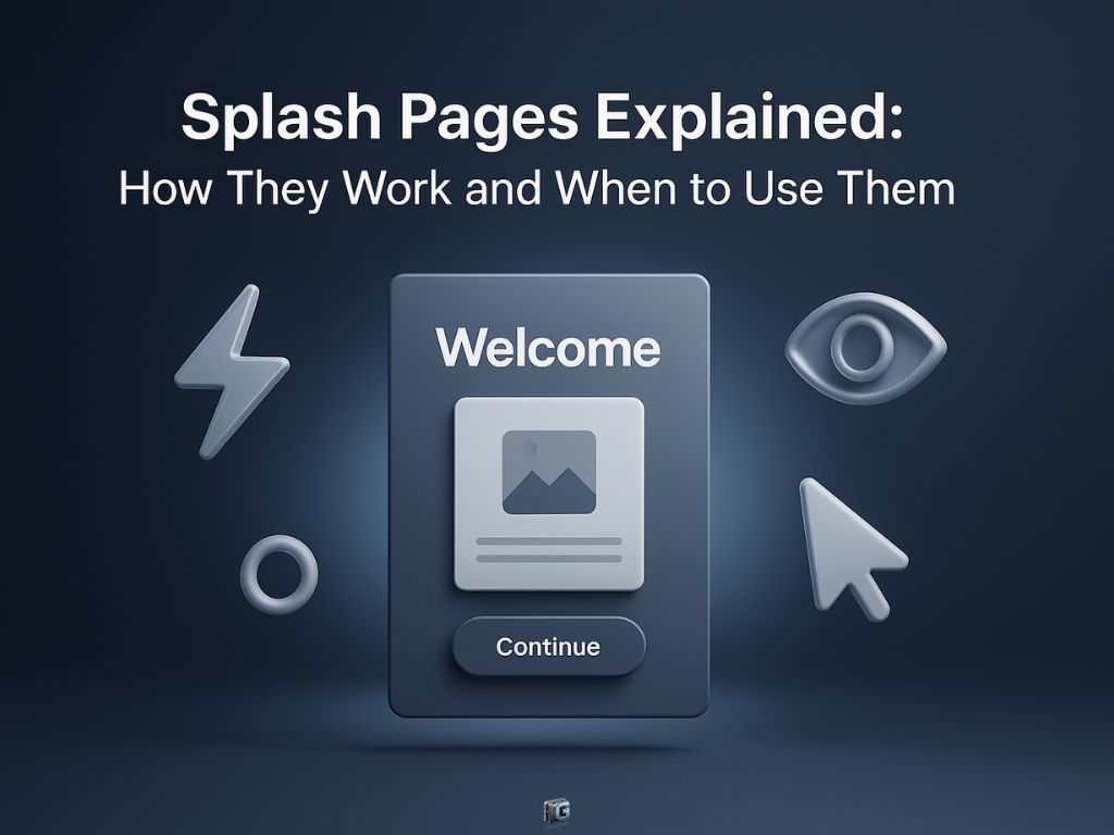
That’s where a splash page comes in. A splash page is a standalone entry screen that appears before someone accesses your main website or content. It’s not designed for deep browsing or selling, it’s built to deliver one clear message, highlight an announcement, or confirm a requirement like age or language preference.
In 2025, splash pages are still powerful tools when used strategically. They can spotlight promotions, reinforce branding, gate access, or direct visitors toward a campaign without cluttering your homepage.
This guide will break down exactly what splash pages are, how they differ from landing pages, real-world examples, and the best practices for using them effectively. By the end, you’ll know when a splash page strengthens the visitor journey and when it risks getting in the way.
Key Takeaways
- A splash page is an entry screen that delivers one focused message before the main site.
- Splash pages work best for promotions, compliance, and routing visitors by preference or region.
- The best splash pages load fast, stay simple, and make the next step obvious.
- Splash pages can harm usability when they appear too often or add friction without clear value.
- A splash page should support the visitor journey, not interrupt it.
Disclaimer: I am an independent Affiliate. The opinions expressed here are my own and are not official statements. If you follow a link and make a purchase, I may earn a commission.
What Is a Splash Page?
A splash page is a standalone entry screen that appears before a visitor reaches your main website or content. Its purpose is not to provide full navigation or in-depth information but to deliver a single, focused message.
That message could be:
- A promotion or announcement (like a seasonal sale).
- A compliance requirement (such as age verification for alcohol or gaming).
- A preference filter (choosing a language or region).
- A branding moment that sets the tone before users enter the site.
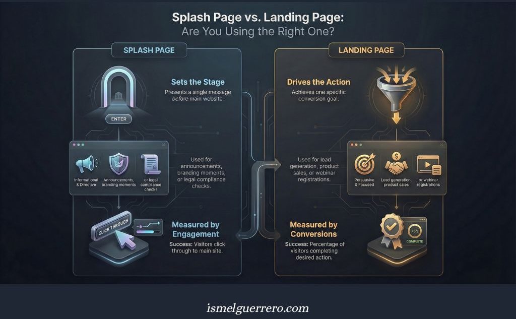
Unlike a landing page, which is built to drive a conversion goal like sign-ups or sales, a splash page is usually informational or directive. It doesn’t try to capture leads or push a checkout. Instead, it guides, filters, or prepares the visitor before they move on.
It’s also different from a pop-up. Pop-ups appear while a user is already browsing a page, often as interruptions. A splash page appears first before the user can explore the rest of the site making it part of the initial experience.
Splash Page vs Landing Page
At first glance, splash pages and landing pages might seem interchangeable. Both are standalone pages, both grab attention, and both serve a focused purpose. But the intent behind them is very different and confusing the two can lead to disappointing results.
Key Differences Between Splash Pages and Landing Pages
| Feature / Focus | Splash Page | Landing Page |
|---|---|---|
| Purpose | Display a single message before entering a site | Drive one specific conversion (sign-up, sale, etc.) |
| Timing | Shown first, before main content is accessed | Reached after clicking an ad, email, or link |
| Navigation | Minimal or none; often just a “continue” button | No navigation; focused entirely on one CTA |
| Content Depth | Very short headline, image, and one action | Can be short or long, depending on the offer |
| Common Uses | Promotions, announcements, branding, compliance | Lead generation, product sales, event sign-ups |
| Measurement of Success | Attention and engagement (did visitors click through?) | Conversion rate (did visitors complete the action?) |
| User Perception | An entry experience, often seen as part of branding | A campaign tool, designed to persuade or convert |
The bottom line: a splash page sets the stage, while a landing page drives the action. Use splash pages to filter, announce, or frame the experience, and landing pages to capture leads or sales. Mixing them up risks confusing your visitors and weakening your results.
This isn’t just semantics. Conversion optimization standards consistently distinguish splash pages as entry mechanisms, while landing pages remain the dedicated engines for campaign-driven conversions.

Benefits of Using a Splash Page
When used strategically, splash pages can add real value to the visitor experience and your marketing efforts. Here are the key benefits:
1. Direct Attention Immediately
A splash page ensures that the first thing a visitor sees is the message you want them to focus on whether it’s a new product launch, a seasonal promotion, or an event announcement. It cuts through the clutter of a homepage and puts the spotlight where it matters.
2. Reinforce Branding
Many businesses use splash pages as a chance to set the tone before visitors enter the site. A striking design, bold statement, or memorable visual can leave an impression that strengthens brand identity.
3. Handle Compliance and Legal Requirements
Certain industries (alcohol, gaming, CBD, etc.) need age verification or disclaimers before showing content. Splash pages make it simple to stay compliant while maintaining a professional experience.
4. Segment or Filter Visitors
Splash pages can guide visitors based on preferences like language, location, or type of user. This ensures people see content that’s most relevant to them from the start.
5. Support Campaigns Without Overhauling Your Site
Instead of redesigning your homepage for every promotion, a splash page lets you spotlight time-sensitive campaigns quickly and effectively. It gives you agility without disrupting your core website structure.
Used wisely, splash pages are more than just “entry screens.” They’re a flexible tool for branding, compliance, and focused messaging helping you capture attention before visitors even begin exploring.
Splash Page Examples in Action
Seeing splash pages in context makes it clear how versatile they can be. Here are common examples of how businesses put them to work in 2025:
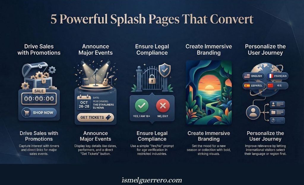
1. Promotional Splash Page
An online store runs a Black Friday campaign and displays a splash page with bold graphics, a countdown timer, and a “Shop the Sale” button before visitors reach the main site.
- Why it works: it captures attention at the peak of interest and drives clicks directly into the promotion.
2. Event Splash Page
A music festival greets visitors with an entry screen showing the event dates, headline performers, and a “Get Tickets” button.
- Why it works: the splash page doubles as both an announcement and a direct call to action.
3. Age Verification Splash Page
A winery requires visitors to confirm they’re 21+ before browsing. The splash page asks for confirmation with a simple “Yes/No” button.
- Why it works: compliance is handled upfront, reducing risk while maintaining professionalism.
4. Seasonal Branding Splash Page
A fashion retailer launches a splash page featuring bold seasonal visuals and a “Continue to Site” button.
- Why it works: it creates an immersive brand experience and sets the tone before browsing.
5. Language or Region Selection Splash Page
An international company uses a splash page to let visitors choose their preferred language or location before entering the site.
- Why it works: it improves relevance by personalizing the journey right from the start.
These examples show that splash pages aren’t one-dimensional. They can promote, filter, comply, or simply set the mood all before visitors even reach the core of your site.
Best Practices for Designing a Splash Page
A splash page only works if it adds value to the visitor’s journey. Done poorly, it feels like an obstacle. Done right, it becomes a seamless entry point that engages without frustrating. Here’s how to design splash pages that work in 2025:
1. Keep It Simple
A splash page should deliver one message, not five. Stick to a clear headline, a supporting visual, and a single action (like “Continue” or “Shop Now”). Clutter confuses and slows visitors down.
2. Prioritize Speed
Because splash pages appear before any other content, they must load instantly. Use lightweight designs, compressed images, and avoid unnecessary scripts. A delay here risks losing the visitor before they see your site.
3. Design Mobile-First
Most visitors arrive on mobile, and splash pages that don’t scale properly are an instant turn-off. Test your layout on multiple screen sizes to ensure it looks sharp and functions smoothly everywhere.
4. Use Strong Visuals
Splash pages are often visual-first. Bold graphics, short videos, or immersive photography can set the tone instantly. The key is alignment: visuals should reinforce the message, not distract from it.
5. Limit Friction
If you’re asking visitors to take an action (like age verification or choosing a region), make it fast and obvious. Never turn a splash page into a form or a questionnaire.
6. Match Campaign Consistency
When a splash page is tied to a promotion or ad campaign, make sure the colors, messaging, and visuals match. Consistency builds trust and reduces confusion.
A great splash page is short, sharp, and visually impactful. It does its job instantly, then gets out of the way so visitors can continue with confidence.
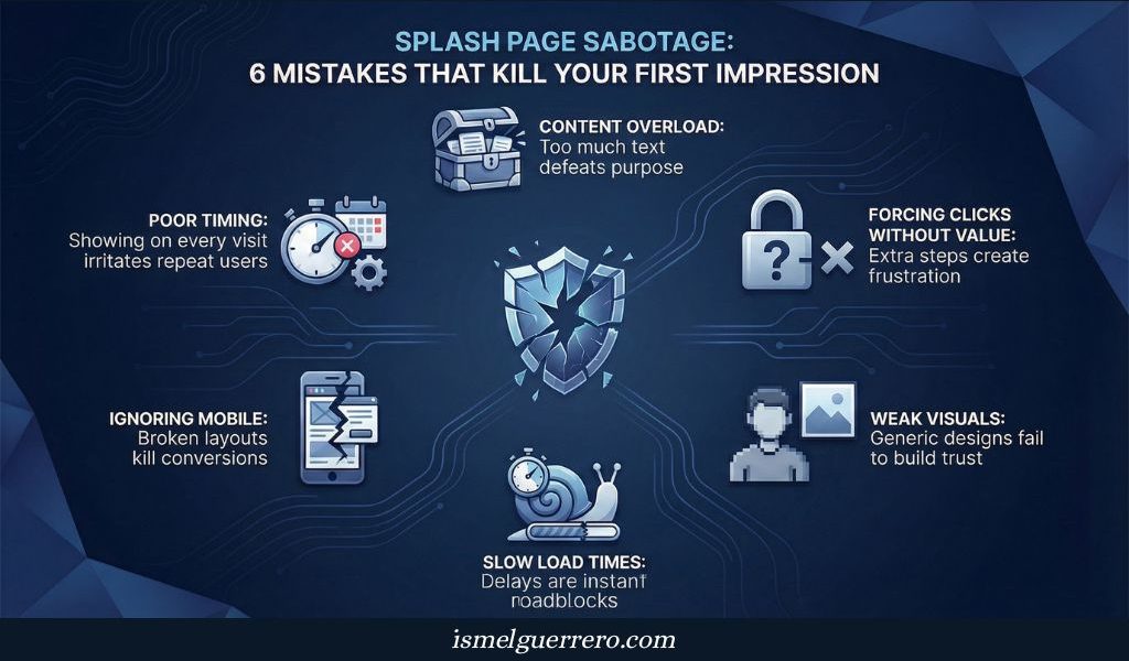
Common Mistakes with Splash Pages
Splash pages can elevate a visitor’s first impression or ruin it. Avoid these common pitfalls that turn them from assets into obstacles:
1. Overloading with Content
A splash page is not a homepage. Adding too much text, multiple CTAs, or several competing messages defeats the purpose. Visitors should understand the message in seconds.
2. Poor Timing
Showing a splash page when it isn’t necessary (like every single visit) quickly irritates users. They should appear only when context demands it for promotions, compliance, or clear branding reasons.
3. Ignoring Mobile Experience
If a splash page isn’t optimized for mobile, visitors may struggle to click buttons or read text. On small screens, that’s a conversion killer.
4. Slow Load Times
Because splash pages appear before the main content, a delay feels like a roadblock. If your splash page takes too long, many visitors will bounce before ever seeing your site.
5. Weak Visuals or Generic Design
A splash page should make a strong impression. Using bland stock photos or poorly aligned graphics weakens trust instead of building it.
6. Forcing Extra Steps Without Value
If a splash page only adds friction without offering relevance or compliance, it frustrates users. Never make someone click through an extra screen for no reason.
The goal of a splash page is to add clarity or impact, not clutter. Avoid these mistakes, and your splash page becomes an asset that guides visitors smoothly into your site.

⚠️ Critical SEO Warning: The “Intrusive Interstitial” Penalty
It is vital to know that Google penalizes mobile sites that use aggressive splash pages (known as “intrusive interstitials”) that block main content immediately upon arrival.
How to Stay Safe:
- The Exception: Google allows full-screen splash pages for legal obligations (like Age Verification or Cookie Consent). You will not be penalized for these.
- The Risk: Google penalizes full-screen marketing splash pages (e.g., “Sign Up for 10% Off”) that hide the content the user searched for.
- The Fix: If using a promotional splash page, ensure it is easily dismissible or consider using a smaller “banner” style on mobile devices instead of a full-screen takeover.
When to Use a Splash Page (and When Not To)
Splash pages can be powerful, but only when they serve a clear purpose. Used in the wrong context, they slow down the experience and frustrate visitors. Here’s when they make sense and when they don’t.
✅ When to Use a Splash Page
- For promotions and campaigns: Highlight seasonal sales, limited-time offers, or special events without overhauling your homepage.
- For compliance: Industries like alcohol, gaming, or CBD often require age verification or disclaimers before access.
- For branding moments: Creative splash pages can set the mood for new product launches, seasonal campaigns, or rebrands.
- For filtering visitors: Language or region selectors help international businesses route people to the right experience from the start.
❌ When Not to Use a Splash Page
- For everyday browsing: Don’t interrupt visitors with an entry screen if there’s no real reason. It adds friction and can increase bounce rates.
- For SEO content: Search engines typically index splash pages poorly, so avoid using them for keyword-driven content.
- For repeat visitors: Forcing returning customers to click through a splash page every time hurts usability and creates frustration.
The rule of thumb: a splash page should enhance the visitor’s journey, not get in the way. If it adds clarity, compliance, or impact, it’s worth using. If it just creates an extra click, skip it.
Usability studies back this up: unnecessary entry screens measurably increase friction for repeat visitors. Splash pages perform best only when tied to specific campaigns or legal requirements.
Conclusion
Splash pages are one of the simplest page types on the web, but when used strategically, they can shape the entire visitor experience. They’re not designed to sell, collect leads, or act as your homepage; their power lies in focus.
Whether you’re highlighting a promotion, ensuring compliance, setting the tone for your brand, or guiding visitors by language or region, splash pages let you deliver one clear message at exactly the right moment.
The key is balance. Overuse or poor execution turns them into friction. But with clean design, fast loading, and a clear purpose, a splash page can elevate your campaigns and make your site feel sharper, more professional, and more intentional.
Now it’s your move. Decide where a splash page makes sense for your business, craft it with clarity, and put it to the test. Done right, this small page can leave a lasting impression.
FAQs About Splash Pages
Are splash pages bad for SEO?
Not inherently, but they don’t usually help either. Because splash pages have little content, search engines may not rank them well. Use them for branding, compliance, or campaigns not as your SEO traffic drivers.
Do splash pages still work in 2025?
Yes, when used strategically. They’re most effective for promotions, compliance, and brand experiences. Overuse or misuse, however, can frustrate visitors and hurt conversions.
What’s the difference between a splash page and a pop-up?
A splash page appears before the main site loads, acting as an entry screen. A pop-up appears while browsing a page, interrupting the experience.
Can splash pages be interactive?
Absolutely. Many modern splash pages include animations, video backgrounds, or interactive elements. The key is to keep them lightweight and purposeful so they don’t slow visitors down.
Do I need special tools to build a splash page?
No. Most website builders, landing page tools, and WordPress plugins can create splash pages easily. The design is simple, what matters is execution and intent.
0 Comments