Most websites are built to let people explore. That is useful until someone arrives because of a specific offer and cannot quickly find it.
A landing page focuses on one offer and one action, such as downloading a guide, registering for a webinar, or buying a product.
This guide explains the types of landing pages, what to put on one, and how to improve it once people begin using it.
- A landing page has a specific goal. It gives visitors the information they need to decide whether to take one intended action.
- The page should match the reason people arrived. If an ad promises a free guide, visitors should see that guide immediately, not have to search for it.
- Different goals need different pages. An email sign-up, a product purchase, and a consultation request call for different levels of explanation.
- Focus does not mean removing useful information. Pricing, terms, proof, and answers to likely objections can help visitors make a decision.
- Measure the result that matters. Sign-ups and button clicks are useful signals, but lead quality, attendance, and purchases may tell you more about whether the page is working.
Disclaimer: I am an independent Affiliate. The opinions expressed here are my own and are not official statements. If you follow a link and make a purchase, I may earn a commission.
What Is a Landing Page?
A landing page is a web page built around a specific offer and the action you want visitors to take. That action might be downloading a guide, joining an email list, registering for a webinar, requesting a quote, starting a trial, or buying a product.
Visitors often arrive after clicking an ad, email, or social post. The page should match the offer that brought them there. If an ad promotes a free webinar, visitors should be able to see what it covers, when it takes place, and how to register without searching through the rest of the website.
A homepage helps people explore a business and choose where to go. A landing page helps them decide whether to take one particular step. It may be short when the offer is easy to understand or longer when visitors need more detail before acting. Either way, the message and call to action should stay focused on the offer.
Landing Page vs. Website Homepage
A homepage and a landing page can both be useful. The choice depends on what the visitor came to do.
| Feature | Landing page | Website homepage |
|---|---|---|
| Primary purpose | Help visitors act on a specific offer | Introduce the business and support exploration |
| Likely audience | People arriving with a defined interest from a campaign or targeted search | People with different questions and levels of interest |
| Content | Details needed to evaluate one offer | An overview of several areas of the business |
| Navigation | Limited to links that help visitors decide or complete the action | Multiple paths to products, services, articles, and company information |
| Main measure | The intended action and the quality of its outcome | A mix of discovery, engagement, and business actions |
Suppose an ad offers a free checklist for planning a first email campaign. Sending visitors to a homepage asks them to locate the checklist themselves. A dedicated page can show what the checklist contains, who it is for, and how to get it.
Types of Landing Pages
Choose the page type according to the action you want now and the amount of information visitors need before taking it. These labels describe common uses, not rigid templates.
Lead generation page
A lead generation page collects information in exchange for something or as the first step in an inquiry. The offer might be a guide, webinar registration, quote request, or consultation. The page needs to explain both what the visitor receives and what happens after submitting the form.
The right form length depends on the follow-up. An email address may be enough to deliver a checklist. A contractor preparing a useful estimate might also need a location and a brief project description. Ask for information you can use at this stage, and explain any request that might surprise the visitor.
Click-through page
A click-through page explains an offer before sending visitors to the next step, often a sign-up or checkout page. It is useful when an ad cannot provide enough context on its own but placing a long explanation in checkout would interrupt the purchase.
For example, a software company might show what its product does, who it helps, and what is included in a trial before linking to account creation. The button click is only part of the result. Track whether visitors complete the next step and whether the offer they find there matches what the first page described.
Sales page
A sales page helps visitors decide whether to buy. It may need product details, pricing, images, testimonials, terms, and answers to common objections. Its length should reflect the decision. A familiar, low-cost product may need less explanation than a course or service that requires a larger commitment.
The job of the page is to make the offer understandable and credible. A bold promise cannot replace clear information about what is included, what it costs, and what the buyer should expect after payment.
Squeeze page
A squeeze page is a brief form of lead generation page, usually focused on an email sign-up. It might contain a headline, a short explanation, and a form. This works best when the offer is easy to grasp without much detail.
Short should not mean vague. “Get a free resource” gives a visitor little reason to share an email address. “Get the one-page checklist for setting up your first welcome email” says what the resource is and who could use it. The page should also make the expected email follow-up clear.
Splash page
A splash page appears before a visitor reaches the main content. It may carry an announcement, direct visitors to a language or location, or handle a required age check. Because it adds a step, use it only when that step serves a real purpose.
A promotional screen that blocks content can frustrate visitors. It should not be treated as a default landing page format for every campaign. Google’s guidance on interstitials distinguishes mandatory checks from intrusive screens that can make content harder to access and understand.
Thank-you page
A thank-you page appears after someone completes an action. It should first confirm that the action worked and deliver, or explain how to receive, what was promised.
After a webinar registration, that might mean showing the date, time zone, joining instructions, and a calendar option. After a purchase, it means confirming the order and explaining delivery. A related next step can be useful, but it should come after the confirmation rather than compete with it.
Landing Page Examples You Can Adapt
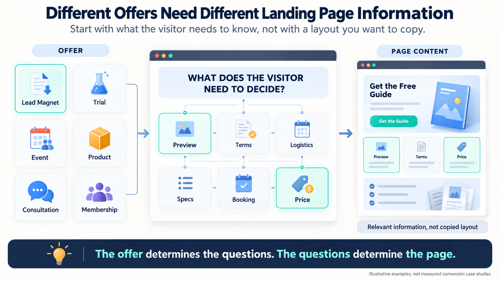
The following are illustrative page ideas, not case studies with measured conversion results. Each one shows how the offer and the visitor’s likely questions change what belongs on the page.
Lead magnet
A page offers a “First Email Campaign Checklist” in exchange for an email address. It shows a preview and names the tasks the checklist covers. The form explains where the resource will arrive and whether the subscriber will receive further emails. The specific contents give visitors a better basis for deciding than a generic “free marketing guide.”
Product trial
A software page offers a trial and shows one or two tasks a new user can complete during it. It states the current trial terms, what happens when the trial ends, and whether payment information is required. A screenshot or short demonstration should clarify the product itself, rather than merely decorate the page.
Webinar registration
A live training page identifies the topic, intended audience, date, time zone, presenter, and what attendees will learn. It also says whether there will be a recording. If registration closes at a real deadline, show it. A countdown should never suggest a deadline that resets for each visitor.
Single-product promotion
An online store sends traffic to a page for one featured product. The page includes useful product photos, dimensions or specifications, shipping information, returns, and relevant reviews. The purchase button is easy to find, but the supporting details help people determine whether the product fits their needs.
Local event
A business promotes an in-person workshop. The page gives the exact address, schedule, cost, accessibility information, and what attendees should bring. Those details can matter more than an elaborate design because a person must know whether they can actually attend before reserving a place.
Case study download
A service provider offers a detailed account of a client project. The page identifies the client’s starting problem, what the case study covers, and the kind of business that could learn from it. If it mentions a result, that result should be documented and placed in context. A large percentage with no baseline or explanation invites doubt.
Contest or giveaway
A page describes the prize and how to enter, then makes eligibility, closing date, selection method, and relevant rules accessible. It should distinguish entering the contest from agreeing to receive marketing emails. The prize may draw attention, but clear terms determine whether the visitor understands the exchange.
App download
An app page shows actual screens or a short demonstration of the main task. It states which devices are supported and provides the appropriate store links. Ratings should be genuine and relevant. Someone choosing an app needs to see what using it will be like, not only a list of broad benefits.
Free consultation
A consultant explains who the call is for, its length, what can be discussed, and what happens afterward. A calendar or short request form makes booking clear. Calling it “free” answers the price question, but visitors may still wonder whether the conversation will be useful or turn into an unwanted sales pitch.
Membership sign-up
A community page describes the resources, events, or discussions included, how often new material appears, the price, and the cancellation terms. A member count or testimonial belongs on the page only if it is genuine and current. The decision is easier when visitors can picture what participation involves after joining.
Anatomy of a High-Converting Landing Page
A strong page does more than assemble a headline, image, form, and button. Each element should answer a question that could otherwise prevent the visitor from acting.
Headline and subheadline
The headline should make the offer recognizable and give the visitor a reason to continue. The subheadline can add the audience, outcome, or essential context.
For a workshop aimed at beginners, “Plan Your First Email Campaign in a Free Workshop” is clearer than “Take Your Marketing to the Next Level.” The first identifies the task and format. The second leaves both to the reader’s imagination. Avoid a specific outcome claim such as “Double Your Sales in 30 Days” unless the offer and evidence genuinely support it.
Offer and value proposition
Explain what visitors receive, who it is for, and how it helps with the task that brought them there. Benefits are useful when they are tied to concrete details. “Save time” means more when the page explains that a template provides the sections a beginner would otherwise have to plan from scratch.
Make the offer’s limits visible too. A consultation may provide an initial assessment rather than a completed strategy. A free trial may give access to particular features for a defined period. Clear boundaries help the right people decide.
Visuals and supporting copy
A visual earns its place when it helps someone understand the offer. Show the product in use, preview pages from the guide, or demonstrate a feature. A stock image may make a page look polished while answering none of the visitor’s questions.
Supporting copy should cover the details that matter to the decision. On a short sign-up page, a few sentences may suffice. On a sales page, visitors may need to understand the process, deliverables, price, terms, and common objections. Cut repetition, but do not cut necessary information merely to make the page shorter.
Proof and trust
Testimonials, reviews, examples, qualifications, and case studies can reduce uncertainty when they are relevant to the claim. Put proof near the point where a visitor might question what the page promises.
A testimonial about friendly service will not establish that a course teaches the advertised skill. A documented example of the work, or a review explaining a specific experience, is more useful. Never invent testimonials, inflate results, or display logos in a way that implies an endorsement you do not have.
Call to action and form
The call to action should tell visitors what happens next. “Download the Checklist,” “Reserve a Seat,” and “See Trial Details” describe different actions more clearly than “Submit” or “Learn More.” If the button opens another step, make that step consistent with the promise on the page.
Keep the form aligned with the action. Request the information needed now, explain how it will be used, and make errors easy to correct. Then test the entire path on a phone. A visible button does little good if the form is difficult to complete or the confirmation never arrives.
Focus without removing essentials
Limit unrelated offers and exits that pull attention away from the main goal. Keep information that helps visitors evaluate the offer, including relevant terms, privacy details, and a way to establish who is behind the page.
One focused action can appear several times on a long page. The goal is a clear decision, not a page stripped of everything that makes the decision trustworthy.
Common Mistakes to Avoid With Landing Pages
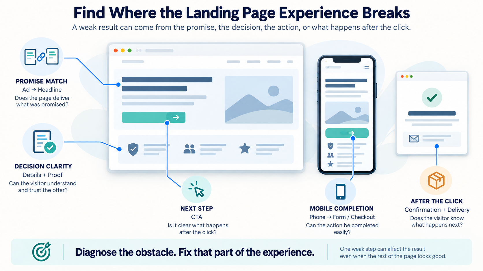
When a page performs poorly, start with the experience it gives the visitor. These problems are more useful to diagnose than a general instruction to “make the design better.”
| Mistake | Why it causes trouble | What to change |
|---|---|---|
| The page does not match the promotion. | Visitors cannot quickly find what they clicked to see. | Repeat the specific offer in the headline and show its essential details near the top. |
| The headline is vague or overpromises. | Visitors either cannot identify the offer or question whether to trust it. | Name the offer and make a claim the page can support. |
| The call to action is unclear. | People cannot tell what clicking will do or where the next step leads. | Use action text that describes the immediate result and check the destination. |
| The page lacks necessary detail. | Visitors still have questions about price, contents, timing, delivery, or fit. | Add the information needed for this particular decision. More copy is appropriate when it resolves uncertainty. |
| Proof is missing or unrelated. | A consequential claim asks visitors to take the business at its word. | Use genuine evidence that speaks to the offer, or narrow the claim. |
| The mobile path is difficult. | A small button, slow page, awkward form, or broken checkout interrupts completion. | Test the page and every step after the click on a phone. Fix the observed obstacle. |
| The thank-you page is a dead end. | Visitors do not know whether the action worked or what happens next. | Confirm the action, provide delivery details, and offer an optional relevant next step. |
How to Tell Whether the Page Is Working
A conversion rate is the share of visitors who complete the action you defined. If 500 people visit a registration page and 25 register, the registration rate is 5%. The calculation is straightforward. Interpreting it takes more care.
Decide what counts as success
First, decide what counts as success. A click-through page should be judged partly by what happens after the click. A consultation page should be judged partly by whether the requests come from people the business can help. More submissions do not automatically mean a better campaign.
Look for the step where people stop
Next, look for the step where people stop. Compare visits with button clicks, form starts, completed forms, and any later purchase or attendance. Review traffic sources and mobile visits separately. If visitors click the call to action but abandon the form, rewriting the headline may not address the problem.
Make changes for a reason you can state
Make changes for a reason you can state. For example: “People start the quote form but rarely finish it. We will move two questions to the follow-up call and see whether completed requests increase without reducing their usefulness.” That gives you something more meaningful to learn than changing the button color because it is easy to change.
Best Landing Page Builders and Tools
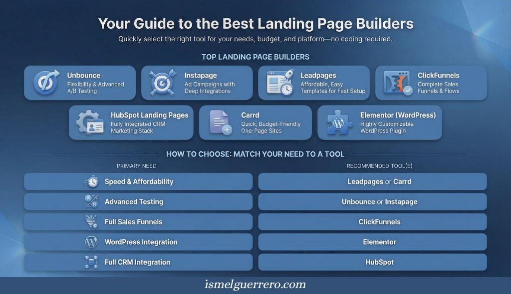
A builder helps you publish the page. It does not decide what the offer should say or whether people want it. Start with the system you already use, then consider a dedicated tool if it solves a real publishing, testing, or follow-up problem.
| Tool | Where it may fit | What to check |
|---|---|---|
| Carrd | A straightforward one-page campaign or simple sign-up page | Whether the plan includes the forms, domain, and connections you need |
| Elementor | A business already publishing through WordPress | Hosting, maintenance, form delivery, and integration with existing tools |
| Leadpages | A business that wants dedicated templates, publishing, and campaign analytics | Which testing and optimization features the chosen plan includes |
| Unbounce | A team running multiple campaigns and testing page variants | Plan limits, traffic needs, and whether there is enough volume to learn from tests |
| Instapage | A team that needs collaboration and reusable campaign pages | Whether those workflow features justify the cost |
| ClickFunnels | An offer that needs connected pages, checkout, and follow-up | Whether the broader system is necessary for the offer |
| HubSpot | A business managing contacts and follow-up in HubSpot | Which page, testing, and automation features are available on its plan |
Conclusion
A landing page works by making a specific offer easier to understand and act on. Its focus is useful when the page matches the reason a visitor arrived, provides enough information for the decision, and carries the promise through the next step.
Start with the offer and the action you want someone to take. Build the page around the questions they are likely to have. Once it is live, use what visitors actually do to decide what needs to improve.
FAQs About Landing Pages
Do I need a landing page if I already have a website?
You may. If a campaign promotes a specific guide, event, product, or service, a dedicated page can address that offer more directly than a general homepage. Your existing website platform may be enough to create it.
Can a product page be a landing page?
Yes. If the product page matches the promotion, provides the details visitors need, and makes the intended action clear, it can serve as the landing page. A separate version may help when a particular campaign requires a different offer or explanation.
Can a landing page receive search traffic?
Yes. People can find a useful landing page through search if it is accessible and relevant to what they are looking for. A short-lived campaign page and a lasting search resource may need different content plans.
How many landing pages should I create?
Create a separate page when an offer or audience needs a meaningfully different explanation. You do not need a new page for every small variation in wording. Each page should have a clear purpose and a result you can measure.
How long should a landing page be?
Long enough to answer the questions that matter for the action, without repeating itself. An email sign-up may need only a brief explanation. A costly or unfamiliar purchase may require substantial detail.
Do I need a dedicated landing page builder?
No. Use your current website platform if it can publish the page, handle the action, and let you evaluate the result. Consider another tool when your existing setup makes those tasks unnecessarily difficult.

2 Comments
15 Landing Page Examples That Convert and Why - Ismel Guerrero. · February 15, 2026 at 8:26 pm
[…] landing page is a focused web page built to drive one specific action. That action might be signing up, starting […]
What Are Master Resell Rights? Guide to MRR Products - Ismel Guerrero · June 21, 2026 at 7:12 am
[…] don’t need a massive website. A landing page with strong copy, a buy button, and an email follow-up sequence is enough to […]