Introduction
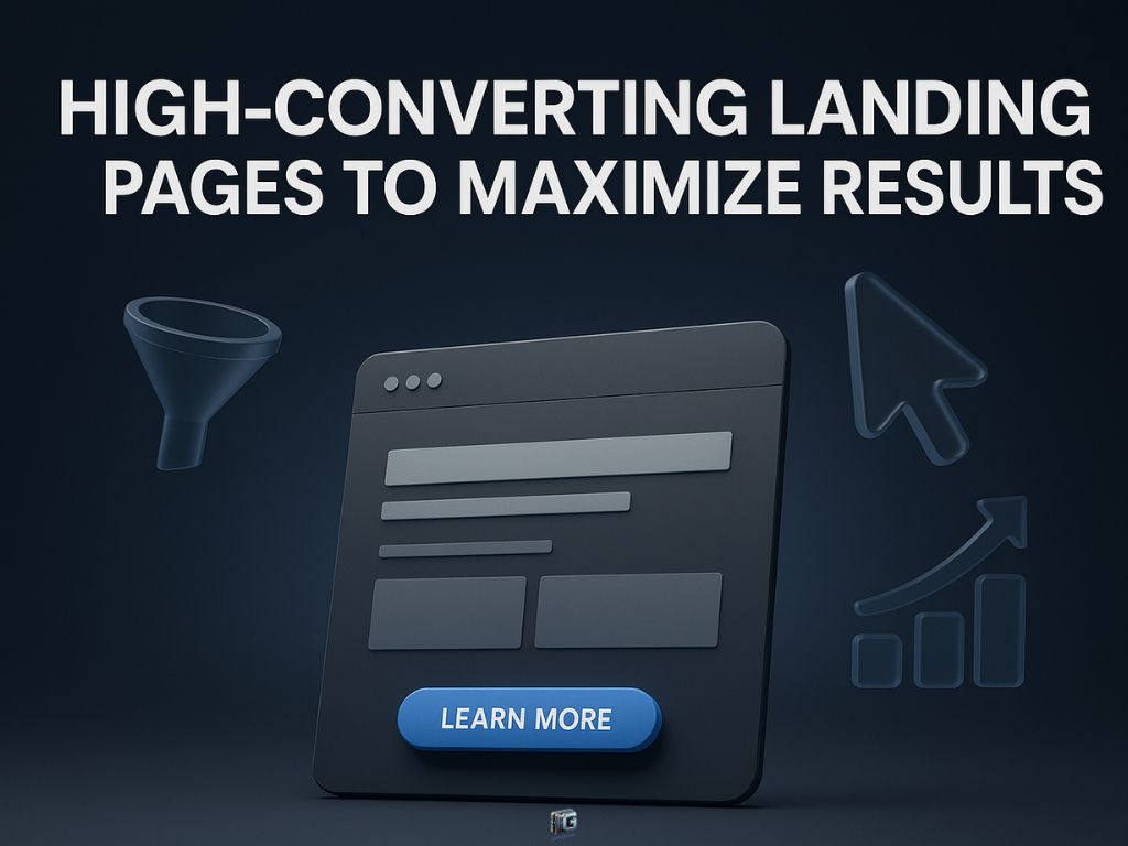
High-converting landing pages are the lifeblood of online marketing in 2025. If you want more leads, more sales, and measurable results, you need a landing page that does more than look good; you need one engineered for maximum conversions.
But what actually separates a high-converting landing page from one that gets ignored?
The rules have changed. Visitors want instant clarity, fast load times, and a seamless experience across any device. Miss any of these, and you’re losing potential customers fast.
This article will show you exactly how to create landing pages that outperform the competition. You’ll discover the proven strategies, essential elements, and data-backed best practices that drive real results in 2025.
Whether you’re building your first campaign or fine-tuning a live page, every tactic here is designed to help you attract more visitors, earn their trust, and guide them straight to your call-to-action.
Ready to transform your landing page into a conversion powerhouse? Let’s get started.
Key Takeaways
High-Converting Landing Pages in 2025
- What separates a high-converting landing page from one that fails in 2025.
- The core elements — headlines, visuals, value, proof, and CTAs — that drive results.
- Modern best practices for speed, mobile-first design, and message consistency.
- How optimization, testing, and data turn a good page into a great one.
- The most common mistakes and how to fix them fast.
Disclaimer: I am an independent Affiliate. The opinions expressed here are my own and are not official statements. If you follow a link and make a purchase, I may earn a commission.
The Truth About High-Converting Landing Pages
Every marketer talks about “beautiful” landing pages. But here’s what most never mention: a gorgeous layout alone won’t move the needle in 2025.
So, what actually does?
Conversion happens when every element on your page works together to guide a visitor, step by step, toward a single, clear action. The headline grabs attention. The copy speaks directly to a burning problem or desire. Every button, every image, every testimonial is there for one reason to remove hesitation and spark action.
Top-performing landing pages never leave visitors guessing. The moment someone lands, they know exactly what’s offered, why it matters, and what to do next. Clarity wins. Distractions kill results.
Under the hood, high-converting pages use psychology to their advantage. Social proof soothes doubt. Urgency motivates. Simplicity removes friction. The user doesn’t have to think, they just act.
If you want your landing page to work in 2025, forget the old “design-first” mindset. Focus on user intent, clear value, and persuasive flow. When everything aligns, conversions climb often faster than you expect.
High-Converting Landing Pages: Core Elements That Drive Results
Every landing page that converts at the top level isn’t an accident. It’s the product of hard-earned strategy, relentless testing, and total clarity about what moves human behavior. Miss one essential element? Your visitors vanish. Nail them all? You set yourself up for conversion rates most marketers never touch.
1. Headlines That Capture Instant Attention
A headline is more than just a greeting; it’s your one shot at seizing attention before your visitor disappears forever. Top-converting pages lead with a promise so direct, so loaded with benefit or intrigue, that the reader can’t help but look closer.
Don’t settle for clever wordplay or vague statements. Instead, tap into raw desire or pain. “Unlock Faster Results,” “Finally, a Solution for Stalled Sales,” “Stop Wasting Traffic Start Converting.”
Test boldness versus clarity, but always answer: “Why should I care?” in five seconds or less.
2. Visuals That Move People to Act
Images and videos are your silent sales team. The best don’t just decorate, they demonstrate.
Think about the difference between a stock photo and a video testimonial from a real customer. The former might fill space. The latter melts skepticism and makes your offer tangible.
Use product shots that highlight real benefits, explainer videos that simplify your pitch, or behind-the-scenes glimpses that humanize your brand.
And remember, every visual should draw the eye closer to your call-to-action not away from it.
3. A Value Proposition Nobody Can Ignore
If a visitor can’t instantly spot what’s in it for them, you’ve already lost. Your value proposition should live above the fold and punch through the noise: “Get X, Without Y,” or “Double Your Bookings No Tech Headaches.”
Break down your offer into one clear promise, three bulletproof benefits, and one dramatic differentiator.
Then, repeat it visually and verbally across the page until it’s burned into memory.
4. Social Proof That Erases Doubt
People follow people. In 2025, no one trusts marketing copy alone, they trust results, and they trust other buyers.
If you have customer quotes, use them. If you have numbers, flaunt them (“Over 10,000 Happy Users”).
Add logos of recognizable brands, screenshots of real results, or video testimonials. Every piece of proof reduces risk and builds a sense of “I want that, too.”
If you lack this? Even the best pitch may stall.
5. Calls to Action That Actually Get Clicks
CTAs are the engine of every landing page and most are just coasting.
A high-converting CTA shouts value, not effort. Compare “Submit” to “Get My Free Demo” one is a chore, the other is a benefit.
Make your buttons impossible to ignore: bold colors, sharp contrast, plenty of white space.
Never force users to hunt for what to do next; CTAs should appear wherever decision anxiety might creep in.
If you’re serious about conversions, split-test your CTA text, size, and placement until you find the message your audience can’t resist.
Stack these elements, and you’re not just building a landing page you’re constructing a digital funnel with no escape hatch except conversion.
Miss even one? Your visitor slips right through the cracks.
High-Converting Landing Pages: Modern Best Practices for 2025
Think the old tricks are still enough? Think again. In 2025, user expectations have shifted rapidly. What worked last year barely moves the needle now. The winners are those who adapt, test, and ruthlessly remove friction from every step of the journey.
Mobile-First Thinking: Why Speed and Simplicity Win
Nearly every visitor arrives on a phone first. If your landing page lags, stalls, or stretches wider than a thumb, conversions plummet.
Remove slow-loading images, bloated code, or anything that causes a lag. Test on real devices, not just a desktop preview.
Simplify layouts to one clear column, bold text, and instantly accessible calls to action. In 2025, speed is not just an advantage; it is a requirement.
How to Strip Away Distractions and Boost Clarity
Every extra link, menu, or competing button is a conversion killer. The highest performers are ruthless. No navigation bars. No social icons. No footer clutter.
Every element must answer, “Does this move the visitor closer to taking action?” If not, cut it.
Clarity is not about minimalism for its own sake. It is about single-minded focus that leads the visitor down one unmistakable path.
Form Optimization: Less Friction, More Leads
Ask for too much, and you will see your conversion rate collapse. Modern forms only require the essentials: name and email, maybe one custom question. Add autofill, clear error states, and visible progress bars for longer forms.
Here is a bonus tip. Test removing fields one by one. Every field you delete removes a barrier.
Matching Your Message from Ad to Page
Consistency breeds trust. If your ad promises a free checklist, the landing page headline must repeat that exact offer.
Mismatch in messaging, color, or imagery creates micro-doubts that stall momentum.
Audit your campaigns. Does the promise made in the ad flow seamlessly into the landing page, headline, and offer? If not, you are losing conversions.
These best practices are not optional. They are the cost of entry for high-performing landing pages in 2025. Ignore them, and your results will wither while competitors surge ahead. Implement them, and every click becomes an opportunity, not just a statistic.

High-Converting Landing Pages: Optimization, Testing, and Growth
Landing page success is never set-and-forget. Even the most polished design can miss the mark if you skip continuous testing and ruthless optimization. The best marketers know that real growth comes from constant tweaks, data-driven experiments, and learning from every visitor’s behavior.
Smart A/B Testing: What Actually Matters
Too many marketers test the wrong things or get lost in endless minor changes. Focus your split tests on what truly moves the needle. Test radically different headlines, try fresh call-to-action texts, or swap major visuals.
Let the data guide you, not your gut. Run tests long enough to gather meaningful results, and do not declare winners too early.
Key Metrics for True Conversion Growth
Tracking “vanity metrics” is a trap. Instead, monitor numbers that reveal real performance. Watch your conversion rate, bounce rate, and average time on page.
If your bounce rate spikes, you know something is pushing visitors away. If time on page drops, your offer might not be clear enough. Every metric tells a story do not ignore the signals.
Real-World Tweaks That Deliver Big Wins
Sometimes, one bold change unlocks a breakthrough. Moving your call-to-action above the fold can instantly increase clicks. Rewriting your headline to hammer the main benefit can double your leads overnight.
Use heatmaps and user recordings to see where visitors get stuck. Look for bottlenecks, hidden obstacles, and moments of hesitation.
Then, tweak, test, and repeat. The highest performers never settle; they treat every landing page as a living asset that evolves with each insight.
Relentless optimization is not just a process, it is your competitive advantage. When your competitors rest, you keep improving. That is how real growth happens.
Check out our A/B Testing Guide.

Common Mistakes (and How to Fix Them)
Even the most well-intentioned landing pages can crash and burn if you overlook the basics. Some mistakes are obvious, but the worst ones often hide in plain sight—silently draining your conversions while you wonder what went wrong.
Clutter and Confusion: The Design Trap
When a landing page tries to do too much, it usually ends up doing nothing at all. Too many colors, mismatched fonts, or a flood of visuals will only overwhelm the visitor. Instead, use clean layouts, clear sections, and a single visual focus. Every design choice should guide the eye toward your call to action. Remove anything that competes for attention.
Too Many Choices, Too Little Clarity
Landing pages with multiple offers, several call-to-action buttons, or mixed messages only create hesitation. A visitor should never wonder, “What am I supposed to do next?” Stick to one clear goal and make your main call to action impossible to miss.
If you add extra links, secondary offers, or navigation menus, you are giving your audience an easy exit.
Neglecting Speed and Mobile Experience
Slow pages kill conversions, period. Compress images, clean up unnecessary scripts, and use tools to check your page speed. Then, test your landing page on every device you can get your hands on.
If your form is hard to fill out on a phone, you are leaving money on the table.
Ignoring Analytics and Real User Feedback
It is easy to skip tracking, but flying blind is a recipe for wasted traffic. Set up analytics from the start. Watch for drop-off points, high bounce rates, or forms that go unfinished. Even better, collect real feedback from users who do not convert, ask what stopped them, what felt unclear, or what would have made them take action.
How to Fix These Mistakes:
- Review your design with fresh eyes and strip out distractions.
- Keep your focus locked on a single conversion goal.
- Make mobile optimization and fast load times non-negotiable.
- Use analytics and user feedback to turn problems into quick wins.
The difference between a landing page that performs and one that fails is rarely luck. It is the result of details you control. Address these mistakes, and you set yourself up for consistent, measurable growth.
Top Tools for Creating Landing Pages
Building a high-converting landing page isn’t just about design, it’s about execution. The right tool takes the complexity out of the process so you can launch quickly, test easily, and focus on optimizing results. Whether you’re running solo campaigns or managing client funnels, the tools below cover every need, from lightweight builders to full-scale marketing platforms.
| Tool | Best For | Key Features | Free Plan |
|---|---|---|---|
| Unbounce | Marketers & agencies | Drag & drop, A/B testing, AI copy, Smart Traffic | No (14-day Free Trial) |
| Leadpages | Small businesses & entrepreneurs | Easy editor, templates, pop-ups, conversion guidance | No (14-day Free Trial) |
| ClickFunnels | Sales funnels & automation | Funnel builder, automation, CRM, native email marketing | No (14-day Free Trial is standard) |
| ConvertKit | Creators & bloggers | Email marketing, landing pages, commerce, simple automation | Yes (up to 10,000 subscribers) |
| Carrd | Simple one-page sites | Affordable, responsive, lightweight, up to 3 sites | Yes (limited) |
Landing page builders are there to shorten the distance between your idea and your launch. Pick the tool that aligns with your business model and scale, then focus on testing, refining, and applying the conversion strategies outlined in this guide. The tool handles the mechanics the strategy is what turns clicks into customers.
Conclusion
High-converting landing pages are not built on guesswork or luck. They are engineered from the ground up with clarity, purpose, and relentless focus on what truly motivates your visitors.
Every headline, every image, every call to action plays a critical role in guiding your audience from first impression to final conversion. When you combine a bold value proposition with sharp design, ruthless simplicity, and data-backed optimization, you stop hoping for results and start expecting them.
In 2025, the gap between pages that simply look good and pages that drive real business growth is wider than ever. Your advantage comes from understanding exactly what works now and having the discipline to refine every detail.
Here is the bottom line. The strategies and best practices in this guide give you the roadmap to outperform the competition, turn more visitors into customers, and capture every opportunity that clicks your way.
It is time to stop guessing and start building landing pages that actually deliver. Measure your results. Adapt quickly. Keep testing. The path to higher conversions is always open to those willing to act.

FAQs: High-Converting Landing Pages
What is a good conversion rate for a landing page?
A “good” conversion rate varies by industry and offer, but most landing pages average between 2 and 5 percent. The best performers see rates of 10 percent or higher by applying proven strategies, focusing on clarity, and testing relentlessly.
How do I know if my landing page is effective?
Watch your conversion rate, bounce rate, and average time on page. High-performing pages keep visitors focused and make it easy to take action. Regular A/B testing reveals what works best for your specific audience.
Can I use templates for high-converting landing pages?
Templates are a great starting point, but do not rely on them blindly. Always customize your template to match your brand, audience, and offer. Test different layouts, visuals, and copy until you find what truly converts.
How often should I update or test my landing pages?
Landing pages are never “done.” Review your analytics every month, run A/B tests frequently, and update your content or design as user behavior shifts. Consistent testing keeps your results strong and your edge sharp.
How many calls to action should my landing page have?
The highest converting landing pages usually focus on one primary call to action. Repeating that CTA in multiple places is smart, but avoid offering different actions or too many choices, which can reduce your results.
Do landing page builders really work for high conversion rates?
Yes, modern landing page builders offer powerful features like drag-and-drop editing, built-in analytics, and fast mobile optimization. Still, your results depend on how well you use best practices, customize everything to fit your audience and offer.
0 Comments